
On Tuesday I wrote about my new inflation tracker—I need a better, more marketable name for that. Well, as I was designing the inflation tracker, I concurrently designed an unemployment tracker to track, well, unemployment. And I figured if I shared the one, why not the share the other? Thus, my unemployment in America tracker application thing.
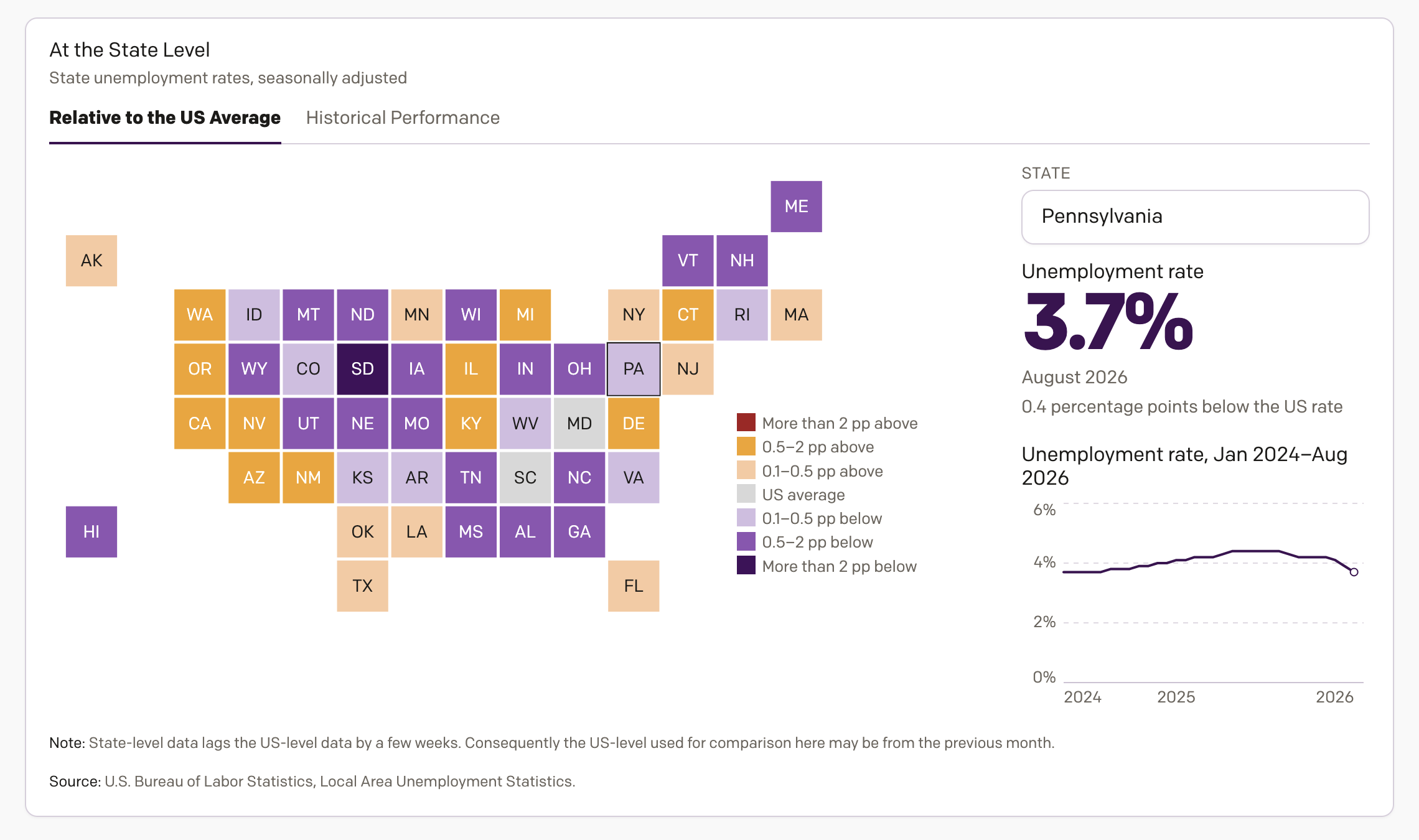
This one, however, takes a slightly deeper dive than with inflation. The screenshot above shows the second main panel or card I designed, which is below the national unemployment rate. But because that line chart looks like the inflation line chart, I figured why not show something visually different here? The second card shows the unemployment situation at the state level, which can vary wildly across the continent.
In fact I defaulted to a map view, using squares instead of geographic shapes to account for the visual discrepancy in state sizes, where I assign states’ colours based upon their deviation from the US average. The deeper orange, the worse things are compared to the US as a whole. The deeper purple, the better. I also offer users the chance to look at a more historical perspective and see how state unemployment rates have changed over the last few years.
In the main card, as I said, the design is similar to that with inflation. A line chart tracking the unemployment rate. But you might not know there are actual several different types of unemployment rates that the US government tracks. I default to U-3, the official headline rate. You turn to CNN on the day the data updates and that will be the big number splashed upon the screen. And it is a valuable number to know.
You can, however, also look at other numbers to get a better sense of underemployment. People who might want full-time work, but can only find part-time. People who have been looking for a long time but, for whatever reason, feel discouraged and may have given up either temporarily or permanently. Take these all together and you can get a better sense of the labour market’s true health. Not that unemployment rates are in and of themselves the best way of looking at the labour market’s health, but I digress.
The data all comes from the Bureau of Labor Statistics.
Credit for the piece is mine.