
I was reading an interesting article from Reuters this weekend about the disparities in wealth in the United States. The article included this interactive graphic, small multiples of line charts showing US household wealth from October 2024 through January 2026.
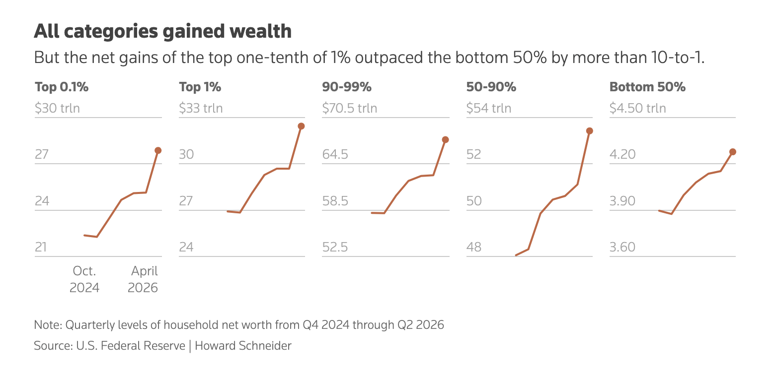
At surface level we have a nice little graphic. We are looking at wealth across five different slices of American households: the infamous 1% and the rest of us. But then if you read a little closer, the chart’s titling and the rest of the article wants you to realise that the wealthiest of American households grew more wealth than the not-so-much-wealthiest. Yet each line looks roughly the same. That part of the story, the discrepancy between the bottom and the top is muddled by the the crucially important, but visually lessened, y-axis labelling. At first glance, the Top 0.1% and the Bottom 50% look roughly similar.
Scale matters.
So what happens if we reimagine the small multiples—usually a favourite of mine—into a single line chart?
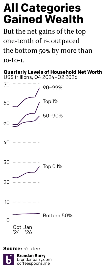
Now, the story is a bit clearer. Look at the relatively flat slope of the Bottom 50% compared to the sharply rising slopes of the rest of America’s households. The slope is flatter and the line sits lower on the chart—the latter obviously. I would argue this graphic better communicates that growth discrepancy.
You could also calculate and chart the growth percentage and be even more to the point. Although I do think using the actual level of household wealth subtly reinforces just how far apart the Bottom 50% are from the Top 1%.
To be fair, my chart works better vertically and at narrower width. At full width, there are so few data points that even the slopes for the high growth lines look fairly flat. (One reason why those widescreen PowerPoint line charts with just a few years or quarters or values generally look so flat and, really, are not so terribly useful.) The designers might have some restrictions about the proportions and dimensions of their charts. In that case, though, I would probably revisit the data used and try to tell a story that better fits the space. (Sometimes function follows form.)
But if locked into the format, the designer could also try to lock the relative y-axis scale for each little chart. The difference between y-min and y-max in the first two is the same—$9 trillion dollars. For the 90–99% cohort, however, that scales jumps to $18 trillion. For the Bottom 50% the scale is only $0.9 trillion. If each were, say, $10 trillion, the difference in scale of growth might also be fairly clear. But in that case, I would probably bump up the visibility of the legend and make it a little bit clearer to the audience. (Although that introduces a break to their likely design guidelines.)
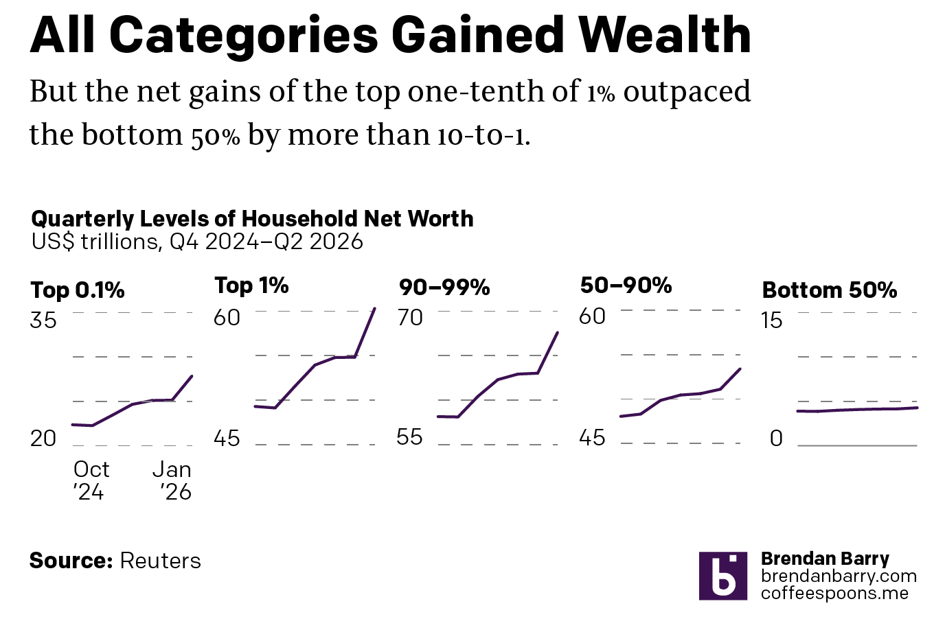
That solution is not as clear as the earlier, but it would probably better fit the horizontal constraints whilst still showing the differences in growth.
Overall, an informative article with a number of other charts that work really well. But this one could have maybe used another round or two of thinking through before committing it to the page.
Credit for the original goes to Howard Schneider.