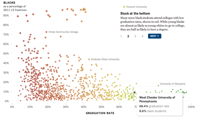
The New York Times has recently done good work with interactive infographics that weave a narrative through their chosen form of data visualisation. I covered one such work back in February that looked at girls in science. Today, a similarly structured piece looks at university admissions and graduation rates for ethnic minorities.

Navigation in the top-right guides the user through the story with key schools highlighted. Of course at any time the user can dive into the data and find specific schools that interest them. Overall the piece is less about data exploration, however, and instead merely uses the wealth of data to paint a context for the broader narrative.
Credit for the piece goes to Josh Keller.
Leave a Reply
You must be logged in to post a comment.