Yesterday both the New York Times and the Washington Post published fascinating pieces looking at the difference in the cost of medical procedures. But each took a different approach.
I want to start with the New York Times, which focused at the hospital level because the data is available at that level of granularity. They created a geo-tagged map where hospitals were colour-coded by whether their bills were below, slightly above, or significantly above the US average.
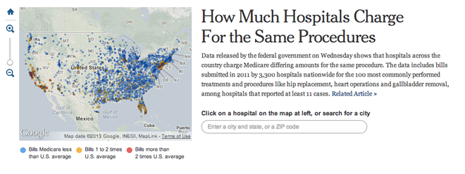
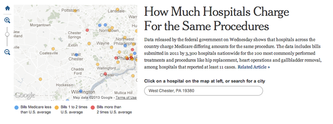
The ability to search for a specific town allows people to search for their hometown, state, country and then compare that to everyone else. My hometown of West Chester, Pennsylvania is fortunate—or perhaps not—to have several hospitals in the area that charge at different rates. That makes for an interesting story. But I am from the densely populated East Coast and someone from say rural Montana might not have the same sort of interesting view.
Regardless of the potential for uninteresting small-area comparisons, once you find your hospital, you can click it to bring up detailed statistics for procedures, costs, and comparisons to the average.
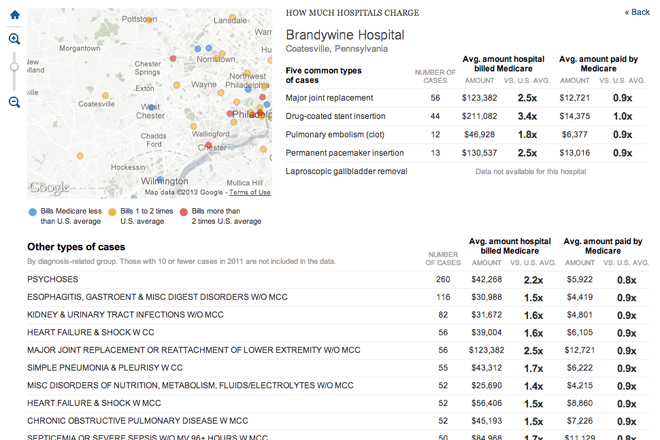
All of this makes for a very granular and very detailed breakdown of hospital versus hospital coverage. But what if you want something broader? What good is comparing Brandywine Hospital to some medical centre in Chicago? Neither is reflective of the healthcare industry in the Philadelphia area or the Chicago area, let alone Pennsylvania or Illinois. The Washington Post tackles this broader comparison.
The Post leads off with a hospital-level example from Miami. Two hospitals on one street have vastly different prices. If we knew about this in Miami we could surely find that in the New York Times map. Instead, the Post guides us to that kind of example.

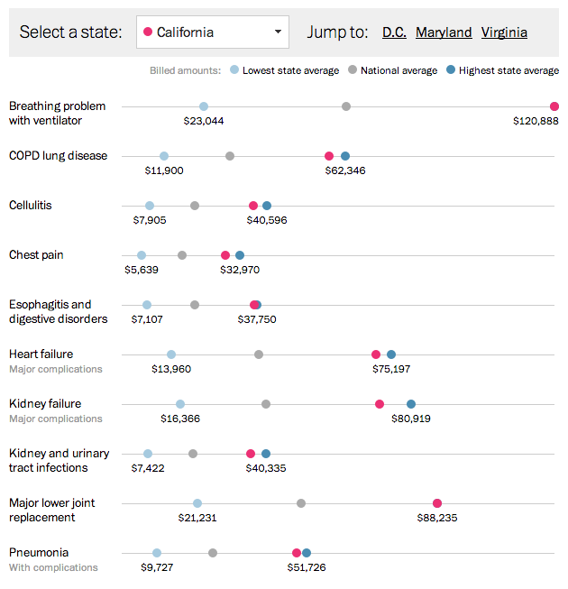
But the broader view is the centre of the piece. Using dot plots and filters, the user can compare the state averages for 10 different medical procedures. Fixed to the plot are the minimum and maximum averages along with the national average. And given the Post’s smaller circulation area—the New York Times is national, the Post is less so—there are quick links to states of particular interest: DC, Maryland, and Virginia.
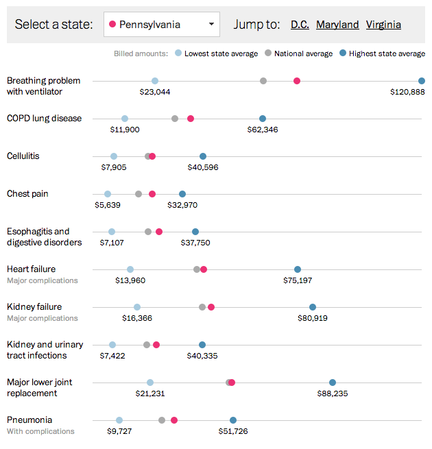
The ability to pick different states from the drop down menu allows the user to quickly see differences between states. What is lacking is perhaps a quick view of where all the states are visible so that the user does not have to click through each individual state.
Both pieces are very successful at their narrowly-focused aims. Neither tries to do everything all at once, but nor would their designs allow for it. Plotting and filtering all the hospitals could be done in the Post’s style, but it would be messy. The state averages could all be made to colour state shape files, but you would lose the inter-procedure differences, the minimums, maximums, and the averages. In short the two pieces from the two teams complement each other very well, but a weird and hybrid-y cross of the two would be large, cumbersome, and potentially difficult to use without spending a lot of time to design and develop the solution. (Which I imagine they did not have.)
Credit for the piece from the New York Times goes to Matthew Bloch, Amanda Cox, Jo Craven McGinty, and Matthew Ericson.
Credit for the piece from the Washington Post goes to Wilson Andrews, Darla Cameron, and Dan Keating.
Leave a Reply
You must be logged in to post a comment.