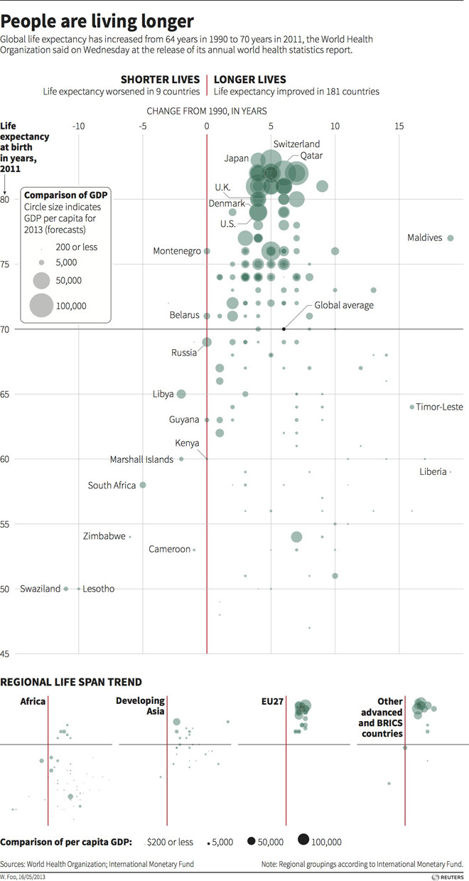
Today’s post is a scatter plot from Thomson Reuters looking at changes in global life expectancy since 1990. What is really nice about this piece is the main space for the data visualisation presents all of the data for all of the available countries. Beneath the main visualisation, the designer chose to use small multiples of the same chart to highlight broader regional trends.

Credit for the piece goes to, I think, Hwei Wen Foo. (Credit on the graphic is W. Foo.)
Leave a Reply
You must be logged in to post a comment.