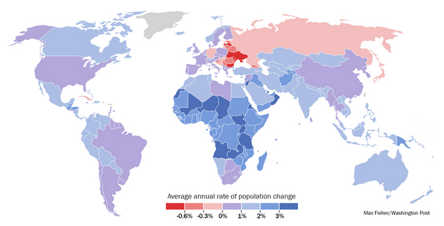
Last week the Washington Post published a piece that looked at demographic trends and their impact on the world’s different geographies. None of the graphics in the piece are revolutionary, nor are they mind-blowing fantasticness. They are, however, clear and concise and show the story. In fact the overall piece is well done because while the graphics show the trends and trajectories, the written word above and below the graphics explains some of the underlying causes and potential effects. In short, a solid piece that is worth the read.
Credit for the piece goes to Max Fisher.
Leave a Reply
You must be logged in to post a comment.