In fact, don’t do this ever. Today’s bad chart comes from the Philadelphia Mayor’s Office of Transportation and Utilities. I saw it and could only shake my head and wonder why.

Something more like this much more easily communicates the story.
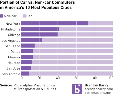
Credit for the original piece goes to the Mayor’s Office of Transportation and Utilities.
Leave a Reply
You must be logged in to post a comment.