Ukraine continues to suffer the effects of a Russian invasion. Though we won’t call it that. This piece from Radio Free Europe looks at the displaced persons in the country. Unfortunately, it is not quite the best example of what to do.
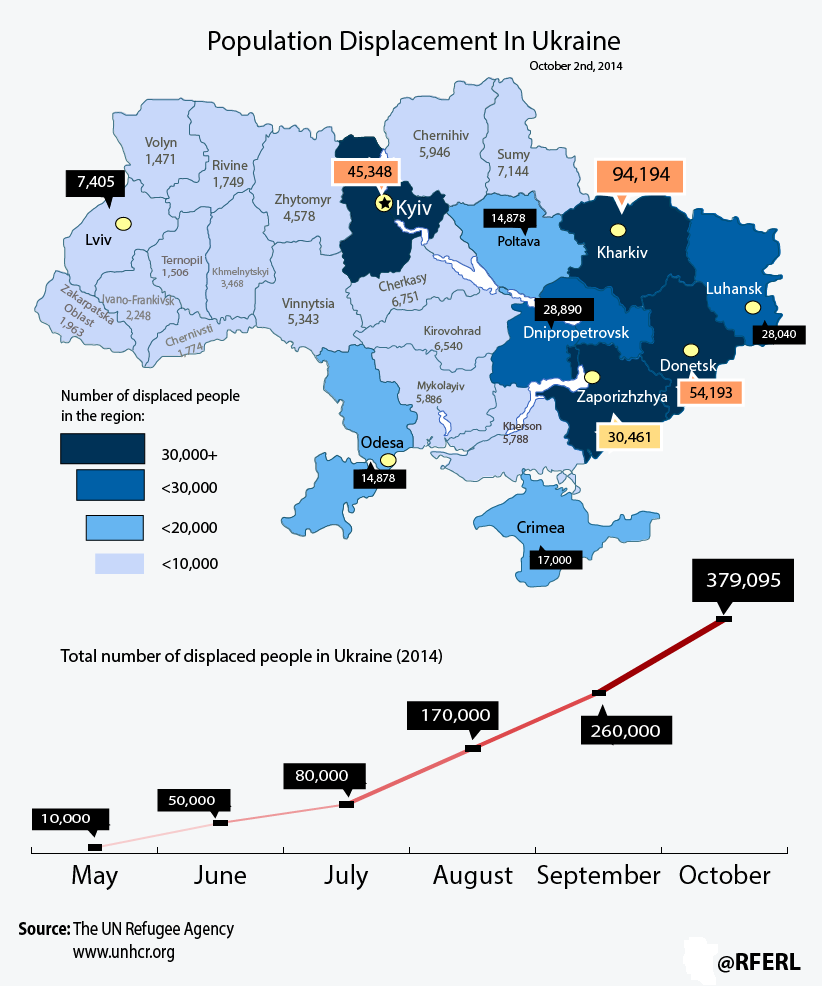
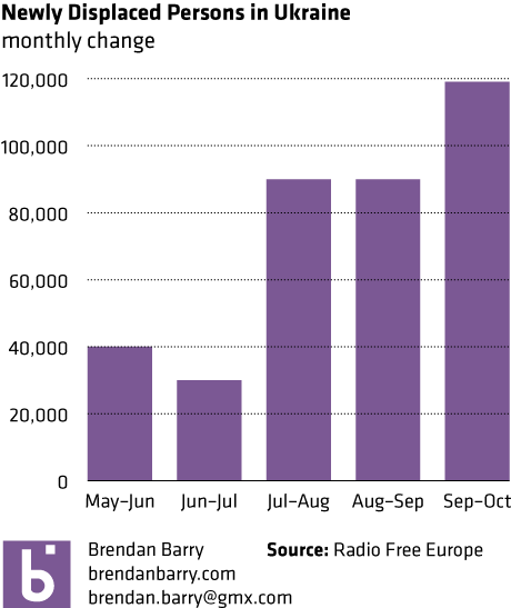
The line chart looks at the cumulative number of displaced persons. But, a monthly growth or absolute number for that month would tell a different story. See below. Hint, it slowed down, and then got pretty bad again.
I am also not a fan of labelling every data point on the map. Maybe call out a few interesting ones, the outliers perhaps. But do we need to know to the person how many people are in Ternopil. Probably not.
Credit for the piece goes to the graphics department of Radio Free Europe.
Leave a Reply
You must be logged in to post a comment.