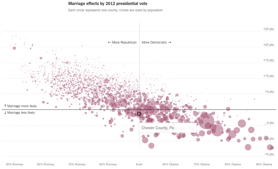
Last week we looked at the New York Times piece on where you grew up’s impact on future income. This week, we look at their follow-on piece, how your hometown impacts your odds of getting married. The piece includes some nice interactive choropleth maps, but my favourite part is the scatter plot correlating politics (as determined by 2012 election votes) to marriage. My hometown (‘s county) is highlighted in the screenshot below.
Credit for the piece goes to David Leonhardt and Kevin Quealy.
Leave a Reply
You must be logged in to post a comment.