Today’s post is about religion. One of the two things you are never supposed to talk about in good company. And since the other is politics and since I cover that here frequently, let’s just go all in, shall we?
FiveThirtyEight has an interesting piece about religious diversity and a corresponding lack of religiousness. From a graphics standpoint, the central piece is this chart below.
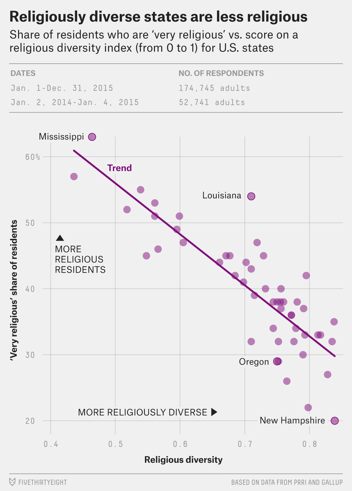
What I would love, however, is for the plot to be interactive. It would be great to let people check out their own individual home states and see how they compare to the everyone else.
Credit for the piece goes to the FiveThirtyEight graphics department.
Leave a Reply
You must be logged in to post a comment.