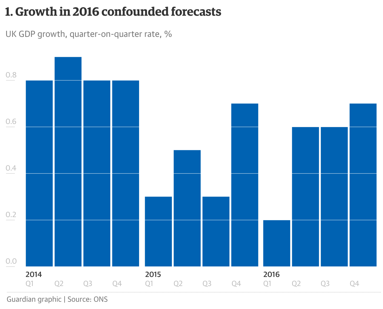
The British government is delivering its budget statement today. So as a teaser, the Guardian published this article with six charts to help understand where things are at. Chart-wise there is nothing radical or revolutionary here, but I have a soft spot for articles driven by data visualisation.
Credit for the piece goes to the Guardian graphics department.
Leave a Reply
You must be logged in to post a comment.