Last night was the third episode of the final series of Game of Thrones and thus marked its midway point. I shall save you from any spoilers, but I thought we could do a lighter post to start the week. This comes from the Economist and simply plots the characters and their implied probability of winning the Iron Throne.
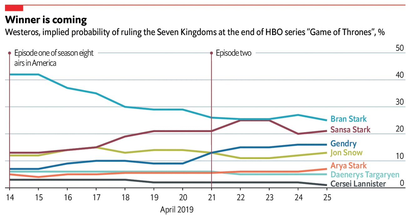
For me, there are too many lines, too many colours and we get the usual spaghettification. But, c’mon, it’s a chart about Game of Thrones. That said, some small multiple grid of characters, sorted by probability would be pretty neat.
Credit for the piece goes to the Economist’s graphics department.
Leave a Reply
You must be logged in to post a comment.