Tag: datagraphic
-
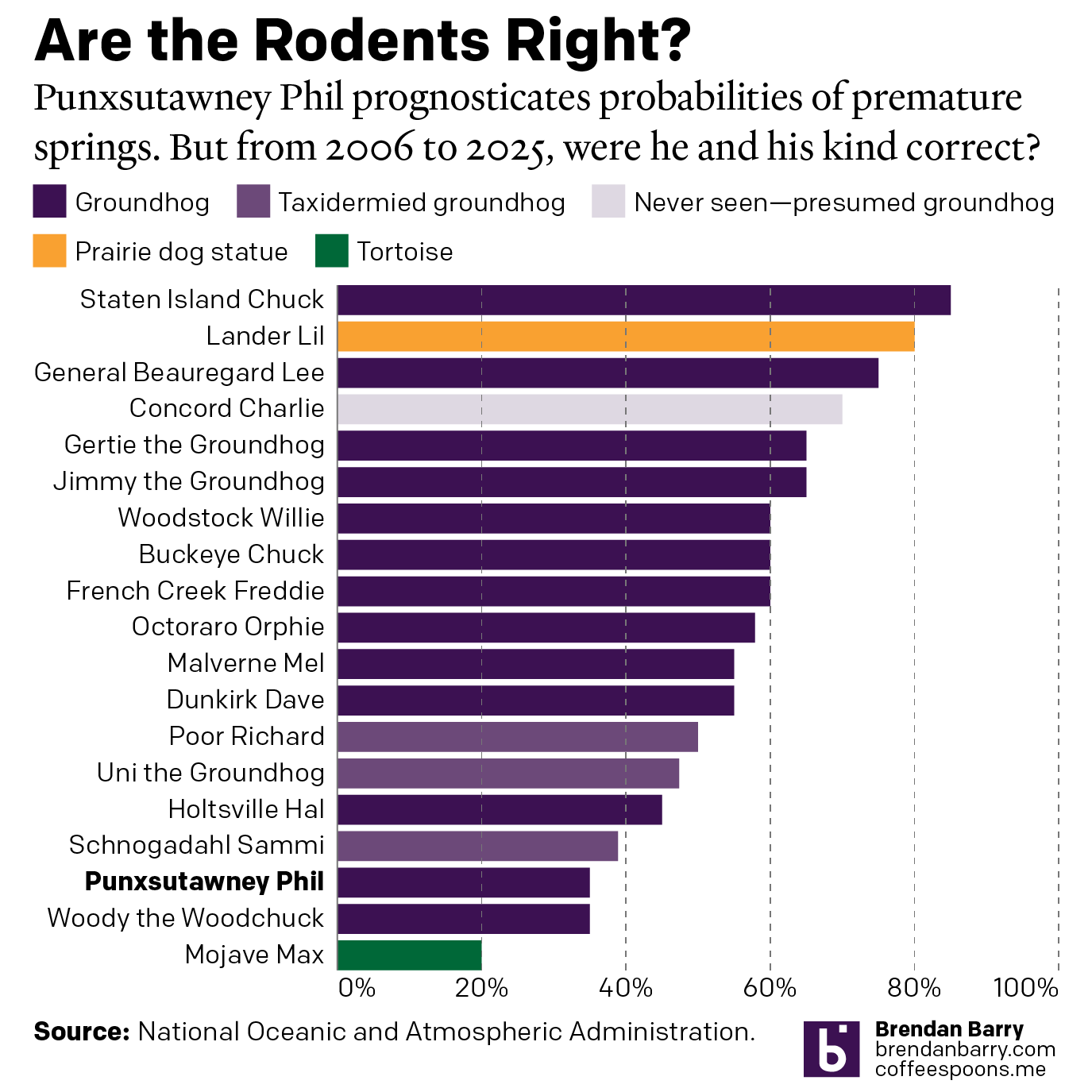
Do We Do This Every Year?
Every year on Groundhog’s Day I feel as if more and more critters crawl up from the Earth to offer their portents of prolonged winter. And every year we look backwards with the fullness of meteorological observations to evaluate the accuracy of these armchair—armburrow?—forecasters. This year, the Philadelphia Inquirer’s required article on the matter included…
-
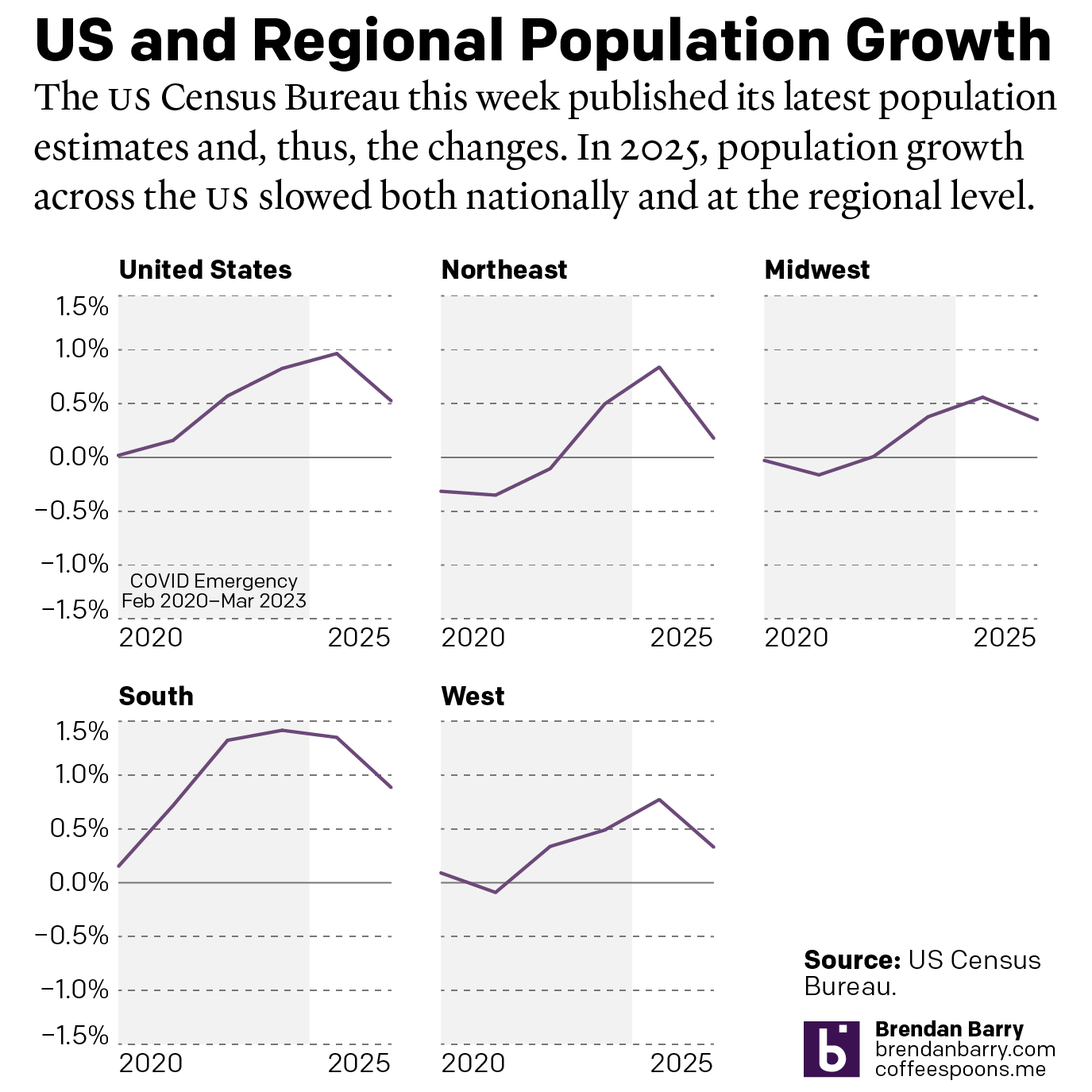
The Slowing of the Growth
This week the US Census Bureau released their population estimates for the most recent year and that includes the rate changes for the US, the Census Bureau defined regions, and the 50 states and Puerto Rico. I spent this morning digging into some of the data and whilst I will try to later to get…
-
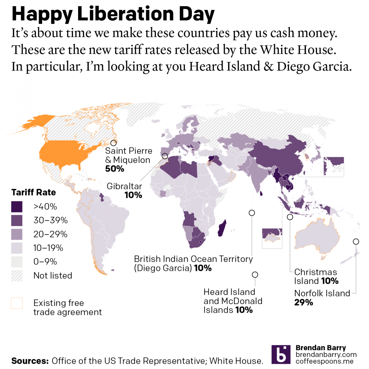
Happy Liberation Day
Yesterday I created a map detailing the new tariff rates released by President Trump on Wednesday. I was inspired by the curious inclusion of several small territories with almost no trade with the United States, and a few of whom are uninhabited. What follows is the graphic and the accompanying text I wrote as I…
-
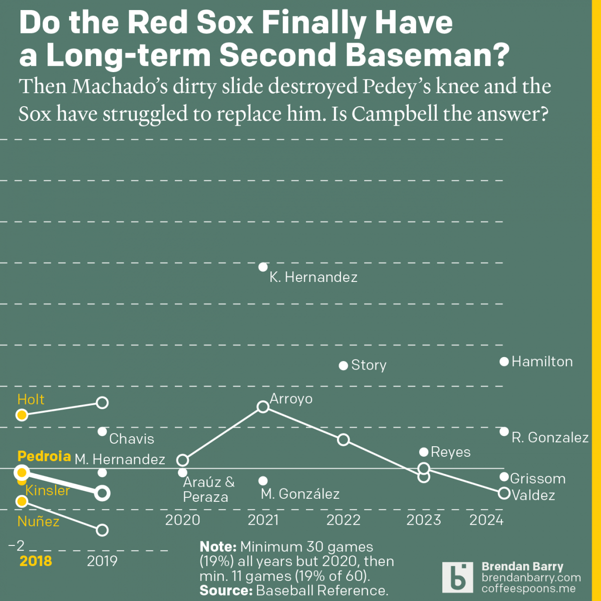
The Red Sox May Finally Have a Second Baseman
Last week was baseball’s opening day. And so on the socials I released my predictions for the season and then a look at the revolving door that has been the Red Sox and second base since 2017. Back in 2017 we were in the 11th year of Dustin Pedroia being the Sox’ star second baseman.…
-
Datagraphics as Marketing Materials
I spent the last two weeks out of town, and my post for the Friday before didn’t happen because there was a fire at my building—I and my unit are fine—that knocked out internet for about 24 hours. But now I have returned. One of the things I did was visit the city of Pittsburgh…
-
Yep, Still Hotter
Like I said yesterday, I wanted to compare cities, surprise, Philadelphia vs. Chicago. And so with some extra time I was able to finish this graphic that took the data from Climate Central to compare the two cities. What you can see below is that Philadelphia has seen more significant temperature growth in both summer…
-
Inflating Areas
One trend people have begun to follow lately is that of rising prices for consumer goods. If you have shopped recently for things, you may have noticed that you have been paying more than you were just a few weeks ago. We call this inflation. The Bureau of Labour Statistics (BLS) tracks this for a…