One trend people have begun to follow lately is that of rising prices for consumer goods. If you have shopped recently for things, you may have noticed that you have been paying more than you were just a few weeks ago. We call this inflation. The Bureau of Labour Statistics (BLS) tracks this for a whole range of goods. We call the the consumer price index (CPI)
Prices can vary wildly for some goods, most notably food and energy. For those of my readers who drive, recall how quickly petrol/gasoline prices can change. Because of that volatility, the Bureau of Labour Statistics strips out food and energy prices and the inflation that excludes food and energy is what we call Core CPI.
Lately, we have been seeing an increase in prices and inflation is on the rise. To an extent, this is not surprising. The pandemic disrupted supply chains and wiped out supplies and stores of goods. But with many people working remotely, many now have pent up savings they want to spend. But with low supply and high demand, basic economics suggests rising prices. As supplies increase in the coming months, however, the rise in prices will begin to cool off. In other words, most economists are not yet concerned and expect this spike in inflation to be passing in nature. But not everyone agrees.
Last week, the Washington Post had an article examining the cause of inflation for a number of industries. To do so, it used some charts looking at prices over the past two years. This screenshot is from the used car section.
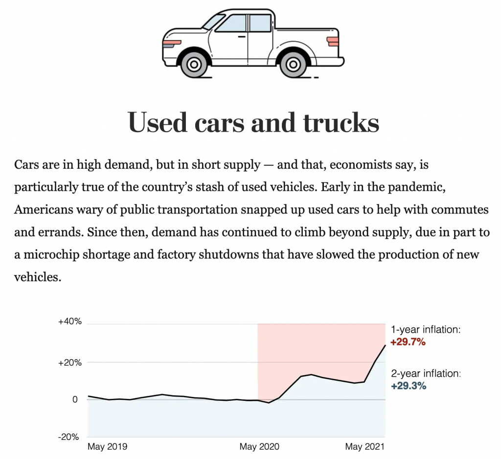
I want to focus on the design of this graphic, though, not the content. The designers’ goal appears to be contrasting the inflation over the last year to that of the last two years. Easy peasy. Red represents one-year inflation and blue two-year.
Typically when you see a chart that look like this, an area or filled line chart, the coloured area reflects the total value of the thing being measured. You can also use the colour to make positive/negative values clearer. In this case, neither of those things are happening.
Because the blue, for example, starts at the beginning of the time series and at the bottom of the chart, it looks like an enormous amount of consistent blue growth. And when the line runs into May 2020, we begin to see what appears as a stacked area chart, with the blue area increasing at the expense of the red.
Another way of reading it could be that the 29.7% and 29.3% increases equal the shaded areas, but that’s also problematic. If the shaded area locked to the baseline like you’ll see in a moment, I could maybe see that working, but at this point it just leaves me confused.
Now you can use the area fill to make it clear when a line dips above or below the baseline, in this case 0%. And I took that approach when I reimagined the chart as seen below.
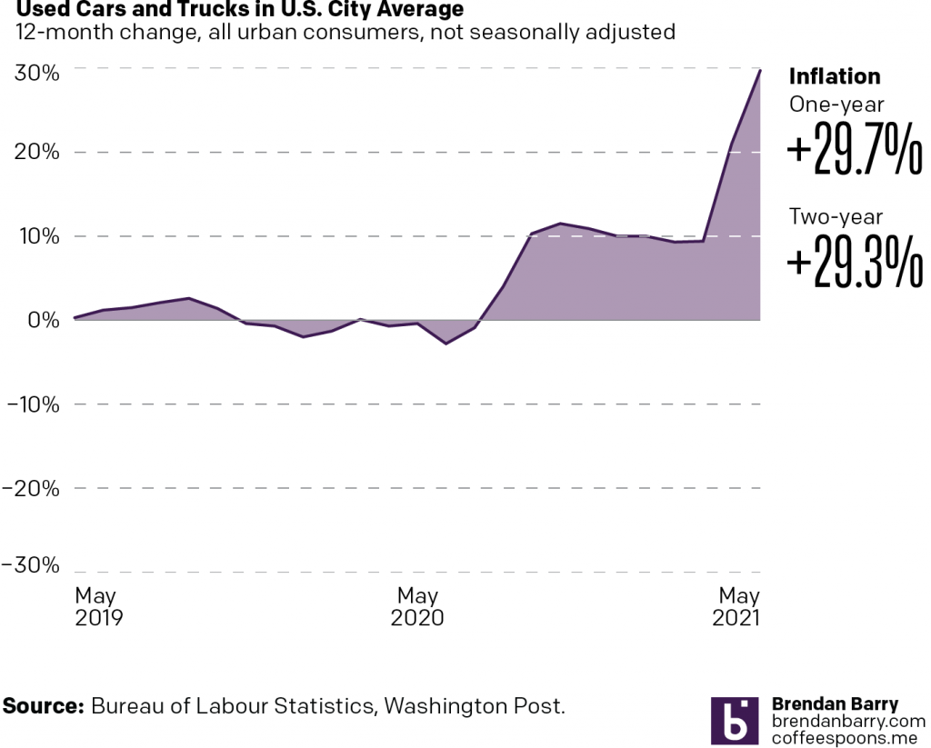
What we do here is we set the bottom of the area fill to the baseline. Consequently, where the chart is filled above 0 we have positive inflation, and where it falls below the 0 line we have negative inflation, or deflation.
We need to note here that the text in the original article talks about the monthly change in inflation, e.g. that used car prices have increased by 7.3% last month. That, however, is not what the chart looks at. Instead, the chart shows the change yearly, in other words, prices now vs last May. To an extent, the 29.7% increase is not terribly surprising given how terrible the recession was.
Ultimately, I don’t see the value in the filled blue and red areas of the chart because I am left more confused. Does the reader need to see how far back one year and two years are from May 2021? Don’t the date labels do that sufficiently well?
This is just a weird article that left me scratching my head at the graphics. But read the text, it’s super informative about the content. I just wish a bit more work went into the graphics. There are some nice illustrations beginning each section, but I kind of feel that more time was spent on the illustrations than the charts.
Credit for the piece goes to Abha Bhattarai and Alyssa Fowers.
Leave a Reply
You must be logged in to post a comment.