I took a holiday yesterday and headed down the street to the Philadelphia City Archives, which houses some of the oldest documents dating back to the founding of the colony. But I was there primarily to try and find deeds and property information for my ancestors as part of my genealogy work.
When I walked into the building—the archives moved a few years ago from an older building in University City into this new facility—an interactive exhibit confronted me immediately. Now I did not take the time to really investigate the exhibit, because I anticipated spending the entire day there and wanted to maximise my time.
But there was this one graphic that felt appropriate to share here on Coffeespoons.
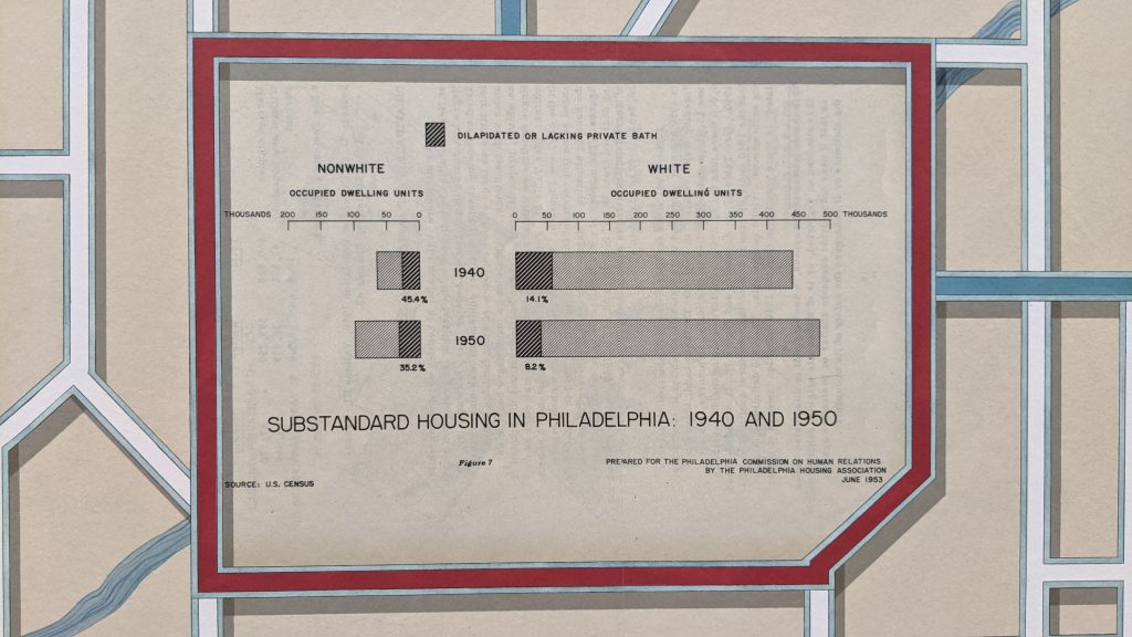
Like a lot of statistical graphics from the mid-20th century we have a single-colour piece because colour printing costs money. It makes use of a stacked bar chart to highlight the share of housing in the city that can be classified as substandard, i.e. dilapidated or without access to a private bath.
The designer chose to separate the nonwhite from the white population on different sides of the date labels, though the scale remains the same. I wonder what would have happened if the nonwhite bars sat immediately below the white bars within each year. That would allow for a more direct comparison of the absolute numbers of housing units.
That would then free up space for a smaller chart dedicated to a comparison of the percentages that are otherwise written as small labels. Because both the absolutes and percentages are important parts of the story here.
The white housing stock increased and the number of substandard units decreased in an absolute sense, leading to a strong decline in percentages.
But with nonwhite housing, the number of substandard units slightly increased, but with larger growth in the sheer number of nonwhite housing units overall, that shrank the overall percentage.
Put it all together and you have significant improvements in white housing, though in an absolute sense there still remain more substandard units for whites than nonwhites. Conversely, we don’t see the same improvements in housing for nonwhites. Rather the improvement from 45% to 35% is due more from the increase in housing units overall. You could therefore argue that nonwhite housing did not improve nearly as much as white housing between 1940 and 1950. Though we need to underline that and say there was indeed improvement.
Anyway, I then went inside and spent several hours looking through deed abstracts. Not sure if those will make it into a post here, but I did have an idea for one over a pint at lunch afterwards.
Credit for the datagraphic goes to some graphics person for some government department.
Credit for the exhibit goes to Talia Greene.
Leave a Reply
You must be logged in to post a comment.