Tag: information design
-
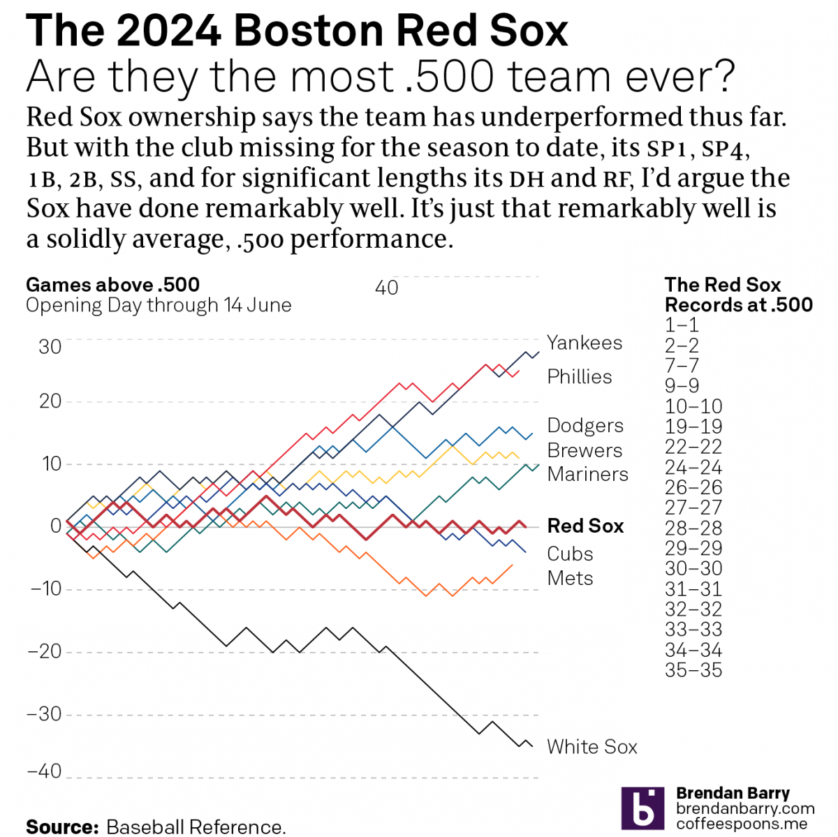
The .500 Red Sox
I initially made this datagraphic over the weekend, after watching the last few weeks of Boston Red Sox baseball wherein they continued to win a game, lose a game, resulting in an even .500 record. When I started, the graphic I sketched looked very different as I had included timelines and highlighted key moments where…
-
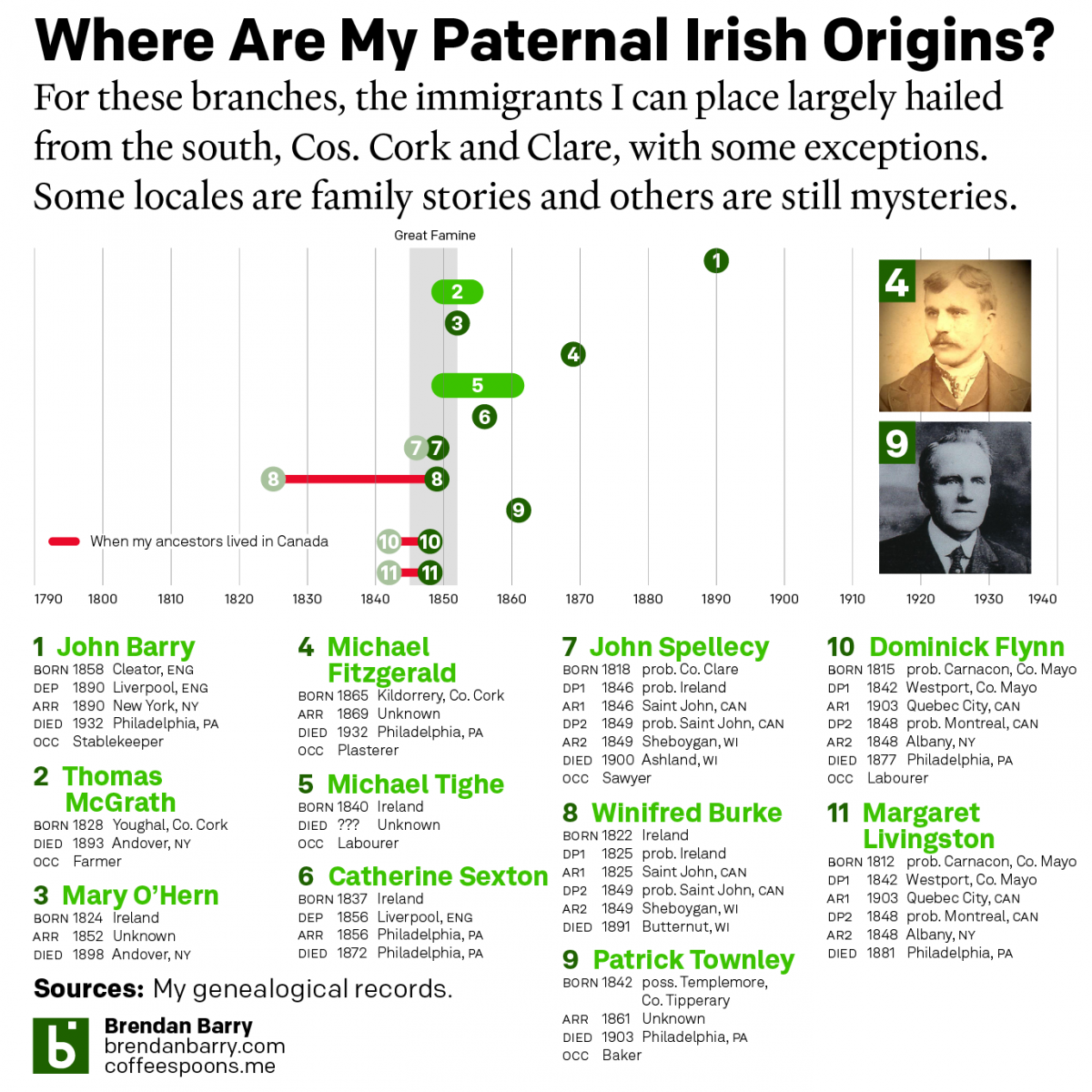
My Irishness
Yesterday was Saint Patrick’s Day and those who have followed me at Coffeespoons—or more generally know me—are well aware that my background is predominantly Irish. Those same people probably also know of my keen interest in genealogy. And that’s what today’s post is all about. Irish genealogy is difficult because of the lack of records…
-
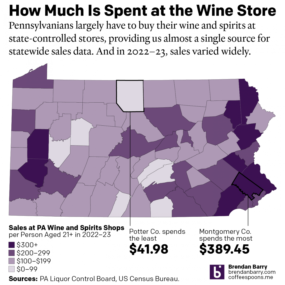
The Sun’s Over the Yardarm Somewhere
It’s been a little while since my last post, and more on that will follow at a later date, but this weekend I glanced through the Pennsylvania Liquor Control Board’s annual report. For those unfamiliar with the Commonwealth’s…peculiar…alcohol laws, residents must purchase (with some exceptions) their wine and spirits at government-owned and -operated shops. It’s…
-
Cavalcante Captured
Well, I’ve had to update this since I first wrote, but had not yet published, this article. Because this morning police captured Danelo Cavalcante, the murderer on the lam after escaping from Chester County Prison, with details to follow later today. This story fascinates me because it understandably made headlines in Philadelphia, from which the…
-
It’s Been a Little While, But I Haven’t Gone Very Far
I last posted to Coffeespoons a year ago. Well, I’m back. Sort of. Over the last year, there has been a lot going on in my family and personal life. Suffice it to say that all’s now relatively well. But the last 12 months forced me to prioritise some things over other things, and a…
-
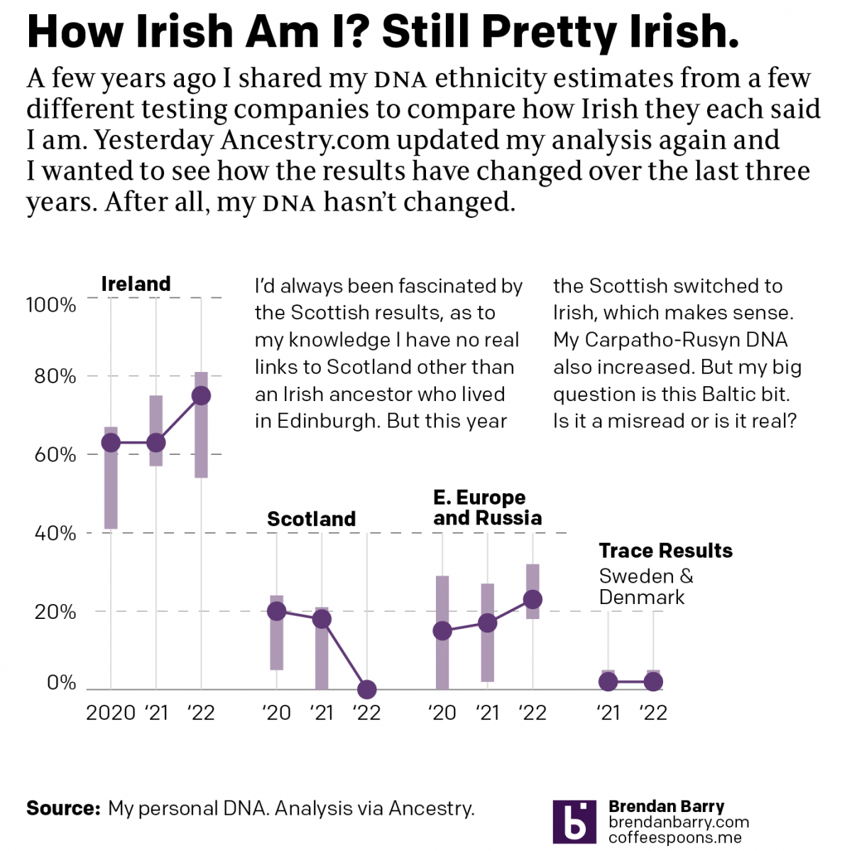
No Matter What You Say, I’m Still Me
As many long-time readers know, I was long ago bitten by the genealogy bug and that included me taking several DNA tests. The real value remains in the genetic matches, less so the ethnicity estimates. But the estimates are fun, I’ll give you that. Every so often the companies update their analysis of the DNA…
-
Climate Conscientious and Cheaper Cars
Sometimes in the course of my work I stumble across graphics and work that I previously missed. In this case I was seeking a post about one of my favourite infographics, but it turned out I’ve never posted about it and so I will have to rectify that someday. However in my searching, I came…
-
Just Keep Grinding it Out
There are certain journalism outlets that I read that consistently do a good job with information design or at least are known for it. Now I try to keep my media diet fairly large and ideologically broad, but in that there are also still some outlets that feature quality design than others. The New York…
-
Asshole
Well, it’s Friday. We made it to the weekend. So here’s a nice Venn diagram from Indexed that captures that guy we all know. Credit for the piece goes to Jessica Hagy.