Sometimes in the course of my work I stumble across graphics and work that I previously missed. In this case I was seeking a post about one of my favourite infographics, but it turned out I’ve never posted about it and so I will have to rectify that someday. However in my searching, I came upon an article from the New York Times last year where they wrote about research from MIT that compared the carbon dioxide emissions—bad for the environment and climate—per mile to the average monthly cost of a wide range of 2021 vehicles. The important distinction here is that average monthly cost is not the sticker price of a vehicle, but rather the sticker price plus lifetime operating costs. (For their analysis, the authors assumed a 15-year lifespan and 13,000 miles driven per year.)
Why is this so important? It’s pretty simple, really. In the United States, vehicle emissions are the largest source of carbon emissions. And the vast majority of that is due to passenger vehicles. If we as a society want to get serious about reducing our carbon footprint, the biggest changes we need to make are reducing our amount of driving, moving more people into mass transit, or switching out people’s gas-powered vehicles for electric vehicles.
The New York Times turned their work into a really nice static datagraphic. It is static, so there is no real interactivity if you want to compare your vehicle to others. However, the designers did choose some popular models and identified some of the key outliers.
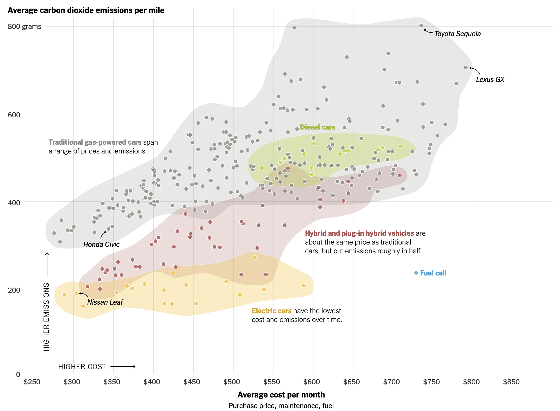
The designers group the cars, represented by dots, into colour fields. These do a good job of showing how there is overlap between the different types of vehicles. Not all hybrid and plug-in vehicles are cheaper or even less CO2 emitting than some gas-powered vehicles, typically your smaller compacts and hatchbacks. Each colour field is linked to a textual annotation that also functions as a legend.
That alone is very helpful in understanding the differences, subtle and not-so-much, between the types of vehicles. Later on in the article the designers also used a scatter plot of a narrower set of data to compare a select set of vehicles.
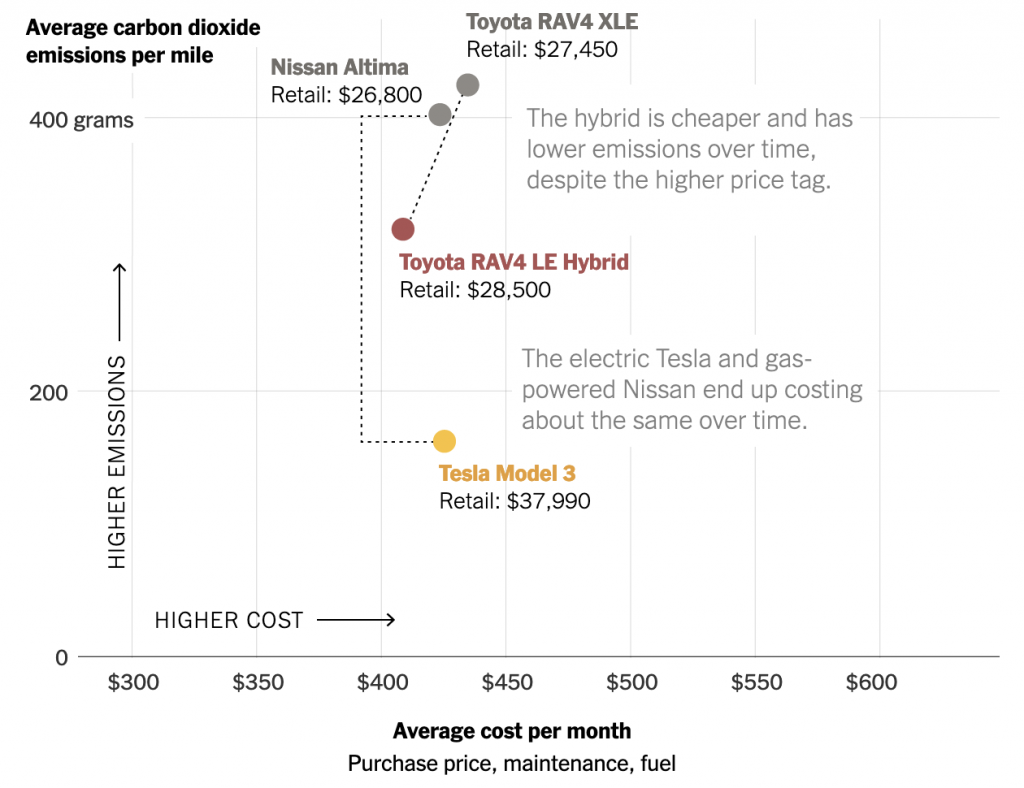
Here we can see that one cannot simply assume that all electric vehicles are cheaper long-term than their gas-powered compatriots. Here we can see that the Nissan Altima, whilst emitting more CO2, compares favourably with the Tesla Model 3 in both the long-term cost but also in the upfront sticker price.
Despite finding this article a year and a half late, we can tie this to current events in that President Biden’s climate bill creates tax credits for electric vehicles. While the bill is perhaps not as significant as many would like, it is remarkable for still being a lot of money devoted to reducing our emissions. And when it comes to electric vehicles, one of the key components is the creation of tax credits. These would help mitigate those upfront sticker costs of electric vehicles. Because whilst they may generally be cheaper in the long-run, you still need to put up more money than their conventionally-powered alternatives either as lump sums or down payments. And with interest rates rising, what you need to cover via an auto loan will become more expensive.
Overall this is a really nice piece. Should I ever need to buy another vehicle, I would love to see this as a resource available to the general public. Unfortunately it only compares 2021 vehicles. And it does make me wonder where my 2005 vehicle compares. Probably not too terribly favourably.
Credit for the piece goes to Veronica Penney.