Well, I’ve had to update this since I first wrote, but had not yet published, this article. Because this morning police captured Danelo Cavalcante, the murderer on the lam after escaping from Chester County Prison, with details to follow later today.
This story fascinates me because it understandably made headlines in Philadelphia, from which the prison is only perhaps 30–40 miles, but the national and even international coverage astonished me. Maybe not the initial article, but the days-long coverage certainly seemed excessive when we had much larger problems or notable events occurring throughout the world.
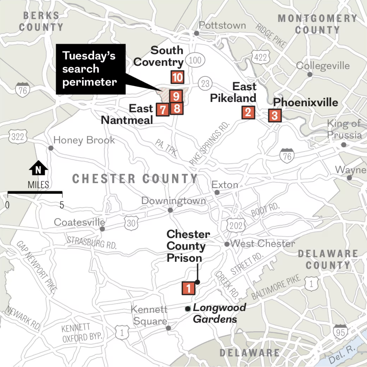
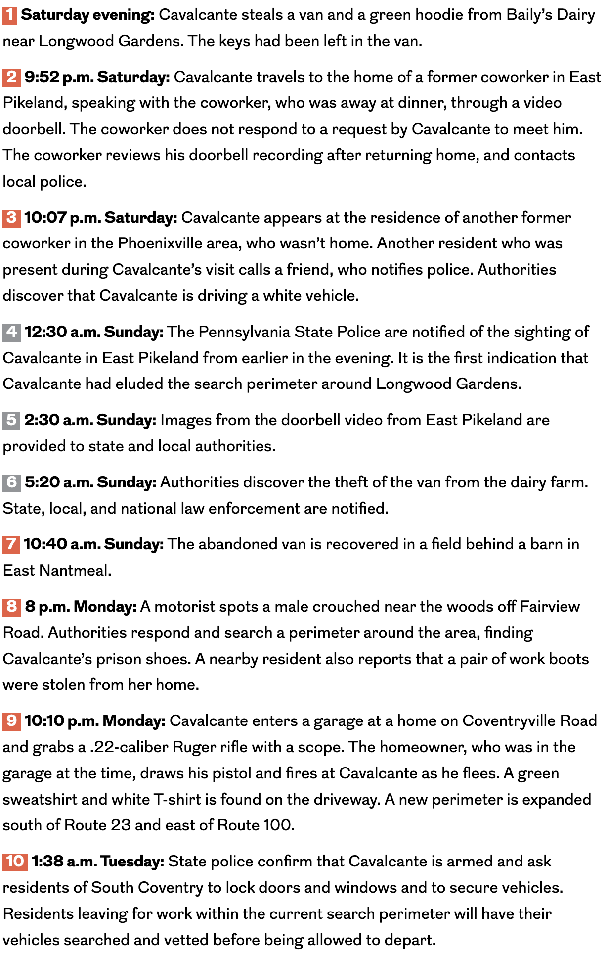
That brings me to this quick comparison of these two maps. The first is from the local paper, the Philadelphia Inquirer. It is a screenshot in two parts, the first the actual map and the second the accompanying timeline.


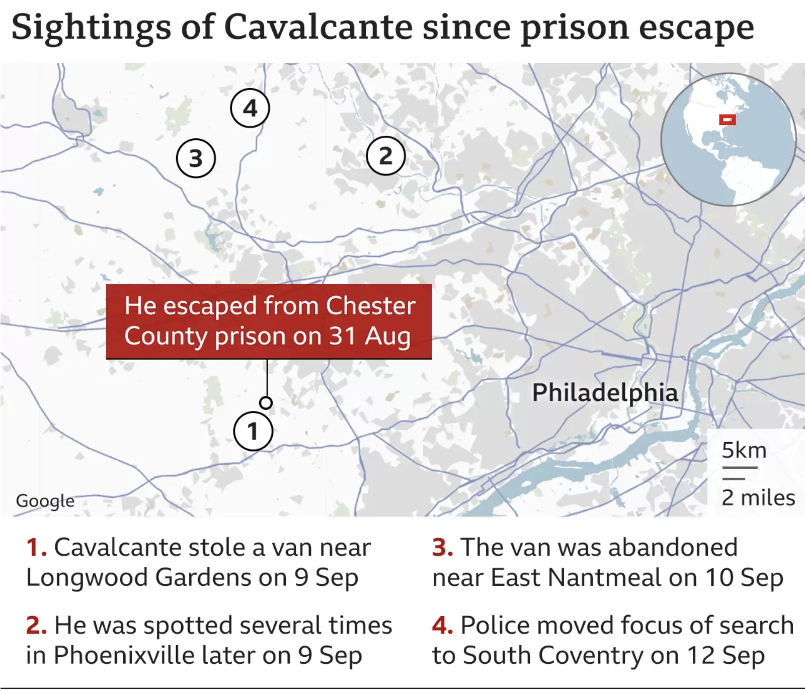
Then we have the BBC and their map of the story:

Both maps use light greys and neutral colours to ground the reader’s experience, his or her welcome to the world of southeastern Pennsylvania. The Inquirer uses a beige and a white focus for Chester County and the BBC omits county distinctions and uses white for rural and grey for built-up areas around Philadelphia.
Both maps use red numbers in their timeline sections to sequence the events, though the Inquirer’s is more extensive in its details and links the red events to red map markers.
The Inquirer leans heavily on local roads and highways with lines of varying width in white with thin outlines. Whereas the BBC marks only significant roads as thin blue lines.
The Inquirer’s map adds a lot of geographical context, especially for an audience fastidiously following the situation. And the following makes sense given all the local closures and anxiety—though I’m of the opinion a significant bit of those closures and anxiety were unwarranted. But for a reader in London, Toronto, or Melbourne, does anyone really need to see Boot Road? Strasburg Road? Even Route 30? Or the Route 30 Bypass (at Route 100, hi, Mum)? Not really, and so the omission of many of the local roads makes sense.
I would keep the roads relevant to the story of the search or the capture, for example Routes 23 and 1, and places relevant, for example Longwood Gardens and South Coventry. Here the BBC perhaps goes too far in omitting any place labels aside from Philadelphia, which is itself borderline out of place.
What I like about the BBC’s map, however, is the use of the white vs. grey to denote rural vs. built-up areas, a contextual element the Inquirer lacks. Over the last two weeks I have heard from city folks here in Philadelphia, why can’t the cops capture Cavalcante in Chester County? Well, if you’ve ever driven around the area where he initially roamed, it’s an area replete with wooded hills and creeks and lots of not-so-dense rich people homes. We don’t yet know where he was finally captured, but in Phoenixville he was spotted on camera because it’s an actual borough (I’m pretty certain it’s incorporated) with a walkable downtown. It’s dense with people. And not surprisingly the number of spottings increased as he moved into a denser area.
The Inquirer’s map, however, doesn’t really capture that. It’s just some lines moving around a map with some labels. The BBC’s map, though imperfect because the giant red box obscures a lot of the initial search area, at least shows us how Cavalcante evaded capture in a white thus rural, less-dense area before being seen in a grey thus built-up dense area.
All-in-all, both are good enough. But I wish somebody had managed to combine both into one. Less road map than the Inquirer’s, but more context and grounding than the BBC.
Credit for the Inquirer piece goes to John Duchneskie.
Credit for the BBC piece goes to the BBC graphics department.