Tag: photography
-
Keyholes to the Memory Holes
For those who have yet to read 1984, my favourite book by my favourite author, memory holes are what the government dump data and documents into to incinerate them and remove all record of their existence. Where is your proof that chocolate production is down this year? The government then points to fabricated replacement data…
-
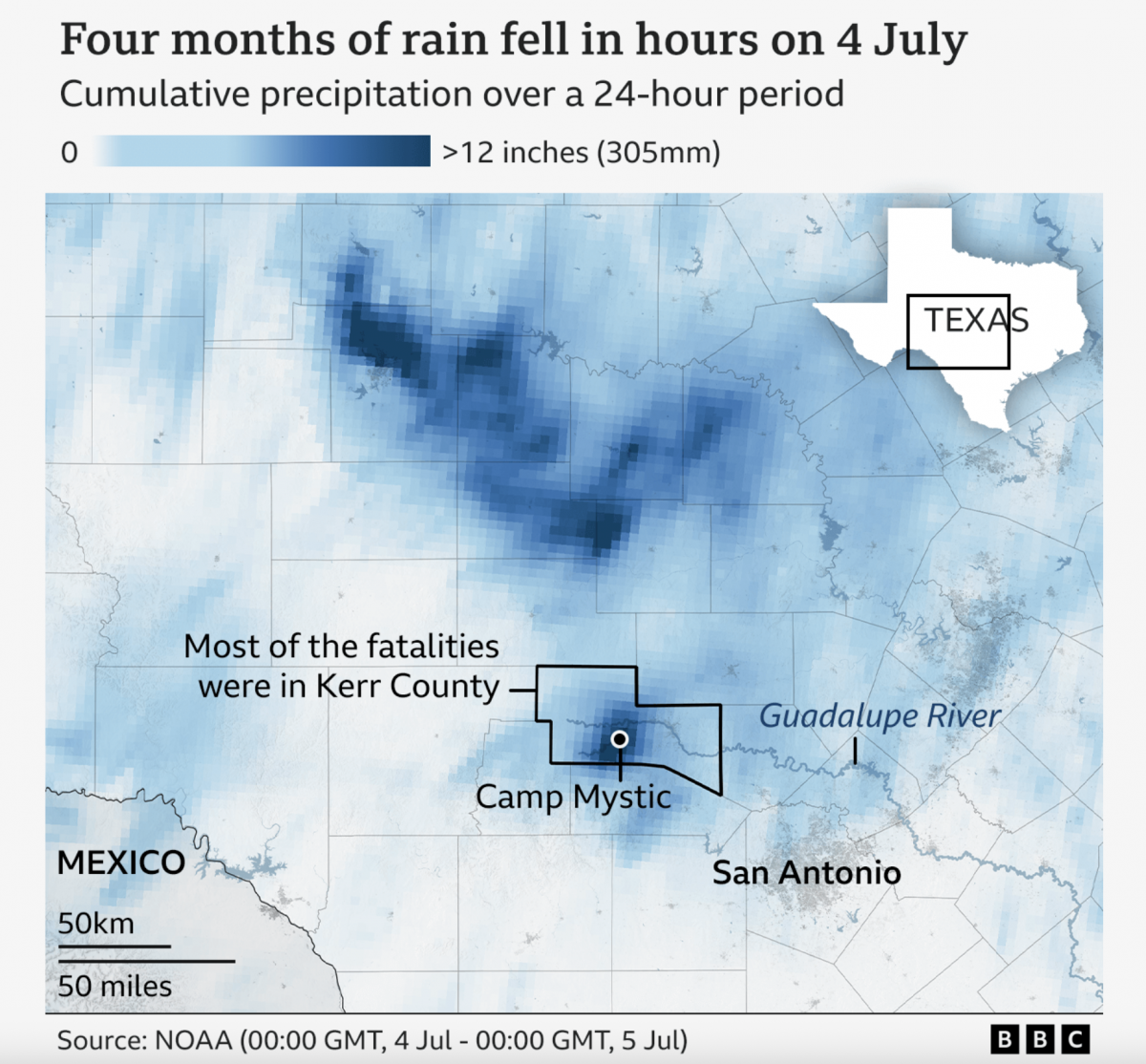
A Warming Climate Floods All Rivers
Last weekend, the United States’ 4th of July holiday weekend, the remnants of a tropical system inundated a central Texas river valley with months’ worth of rain in just a few short hours. The result? The tragic loss of over 100 lives (and authorities are still searching for missing people). Debate rages about why the…
-
Burning Out the Rohingya
For years the Rohingya people, largely Muslim, in Burma (also known as Myanmar) have faced persecution from the majority Buddhist Burmese to the point that they are not considered citizens. Over the last several weeks, the Burmese government has reacted to assaults against civil authorities by armed Rohingya groups by burning villages wholesale. Burma denies it,…
-
How Big Was Irma?
Like many Americans I followed the story of Hurricane Irma over the weekend. One of my favourite pieces of reporting was this article from the Washington Post. It did a really nice job of visually comparing Irma to some recent and more historic storms, such as 1992’s Hurricane Andrew. It can be difficult to truly…
-
Maintaining Your Photo Library
Well yesterday sucked. But at least today is Friday. Also Cinco de Mayo. And so in addition to trying to find some mezcal tomorrow—anybody know a good spot in Philly?—we can wrap this week up with something on the humourous side. My mobile is a few years old now and I’ve been taking lots of…
-
Escaping—or Not—from the Oakland Fire
A few weeks back a fire raged through a communal, creative warehouse in Oakland. The fire claimed the lives of over thirty people. But why? We have the New York Times behind this piece which attempts to explain just what happened that night through a nice mixture of diagrammatic illustrations and photography. Credit for the…
-
Putting Things in Perspective
Congratulations, you made it to Friday. So let’s try to put that in perspective. And by that, I mean things like mines and Death Stars. Thanks to my good friend Jonathan Fairman for sharing with me this post on Core77 that uses the power of Kevin Wisbith’s Photoshop skills to compare the sizes of things.…
-
Moving on Mosul
If you didn’t already know, the Iraqi Army and Kurdish forces are moving on Mosul, a city in northern Iraq overrun by ISIS back in 2014. The New York Times has illustrated a satellite image of the Mosul area to show how the forces are progressing in their assault on the city. Credit for the…
-
Airplanes in Hangars
Today’s post features a simple set of graphics on the BBC, however the creators were actually the Asia Maritime Transparency Initiative. The background? The increasingly tense geopolitical situation in the South China Sea, where China claims numerous islands and reefs claimed by other countries—and to a smaller extent other countries make similar such claims. Just a…
-
Selfiexploratory
New year, new selfies. Thankfully we have the Selfiecity to look at a sample of selfies, the goal to determine patterns and trends in the art of the selfie. Of course you also want to be able to look at the aforementioned selfies. For that they built the Selfiexploratory, an application that allows you to…