Like many Americans I followed the story of Hurricane Irma over the weekend. One of my favourite pieces of reporting was this article from the Washington Post. It did a really nice job of visually comparing Irma to some recent and more historic storms, such as 1992’s Hurricane Andrew.
It can be difficult to truly compare hurricanes, sometimes they are small and compact, other times more dispersed. Irma was just big with lots of potentially destructive power spread out across a wide area, almost the width of the Floridian peninsula. The article uses several graphics—I am also quite partial to the satellite image comparison so check out the article—but this one is perhaps my favourite.
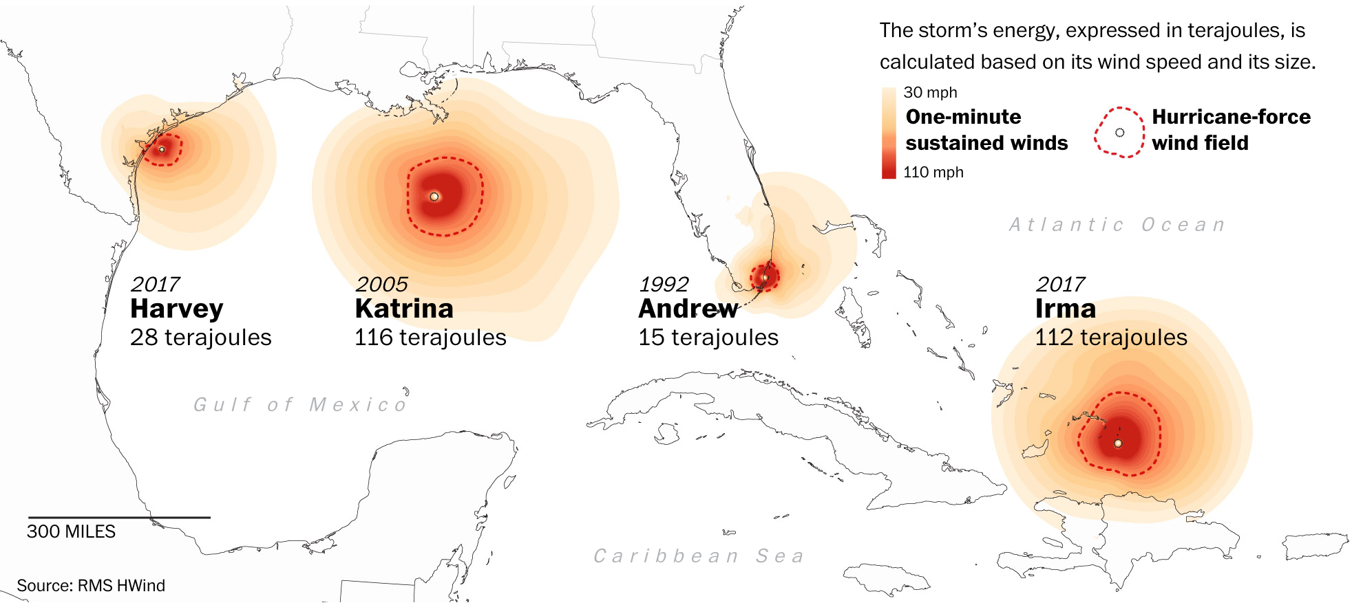
It uses a colour palette that deepens in redness nearer the storm’s centre. This allows the user to compare the geographic area or footprint of the storms destructive winds.
I wonder, however, what would happen if the designers had superimposed each graphic atop the other. It might have allowed for an even better comparison of size instead of having to have the user mentally transpose each hurricane.
Still, a really nice graphic and visual article.
Credit for the piece goes to Bonnie Berkowitz, Laris Karklis, Reuben Fischer-Baum, and Chiqui Esteban.
Leave a Reply
You must be logged in to post a comment.