Doctor Who?

I don’t often link to FlowingData because I figure that most of my audience is already looking there. But, sometimes, Nathan’s work is just that good. And sometimes the subject matter is just so fantastic that I have no other choice. (It doesn’t hurt that I was looking to do something like this over the weekend.)

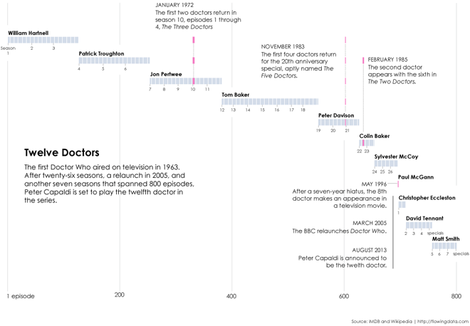
Last weekend, the BBC announced that Peter Capaldi will succeed Matt Smith as the actor behind the lead role in the British science fiction show Doctor Who. The show celebrates its 50th anniversary later this year—quite a feat for a television show from what I gather—as it is enjoying popularity not just in the United Kingdom but now increasingly across the world. But in those 50 years, 11 other actors have held the lead role and Nathan plots out when they had the role . And who.
Who?
Who?

Credit for the piece goes to Nathan Yau.

How to Use Good Data Visualisation in Your Private Life

Often we think of graphs, charts, and other forms of data visualisation as a means to exploring the economic growth of so and so, or visualising traffic patterns, of explaining the complexities of science, or the reporting of yesterday’s news. But, we can all use data visualisation in our own lives to help make better decisions.

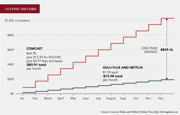
While I normally opt not to post links to other data visualisation blogs—I figure most people are also already checking those out—Nathan Yau posted about why he wants to cut the cable, i.e. lose his cable television subscription. He has two separate charts that are simple but effective in driving home the point that he really ought to think about cutting cable out.

Cutting cable
Cutting cable

The article, while a bit longer than usual, is well worth the read. The charts with the explanation make for a compelling argument.