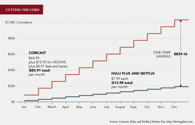
Often we think of graphs, charts, and other forms of data visualisation as a means to exploring the economic growth of so and so, or visualising traffic patterns, of explaining the complexities of science, or the reporting of yesterday’s news. But, we can all use data visualisation in our own lives to help make better decisions.
While I normally opt not to post links to other data visualisation blogs—I figure most people are also already checking those out—Nathan Yau posted about why he wants to cut the cable, i.e. lose his cable television subscription. He has two separate charts that are simple but effective in driving home the point that he really ought to think about cutting cable out.

The article, while a bit longer than usual, is well worth the read. The charts with the explanation make for a compelling argument.
Leave a Reply
You must be logged in to post a comment.