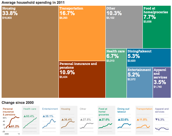
This tree map from the Wall Street Journal looks at an interesting subject: average household spending. How much are we spending on housing, on food, on transportation, &c.?

But I’m not so sure that the main visualisation is necessary. I appreciate the big colour and splashiness, but the space use seems inefficient. Perhaps if the colours had been tied, as is commonly seen, to another variable, the tree map would be more useful. Imagine if the chart looked at the spending value and the average growth over the last ten years, with the year-by-year value still plotted below.
Leave a Reply
You must be logged in to post a comment.