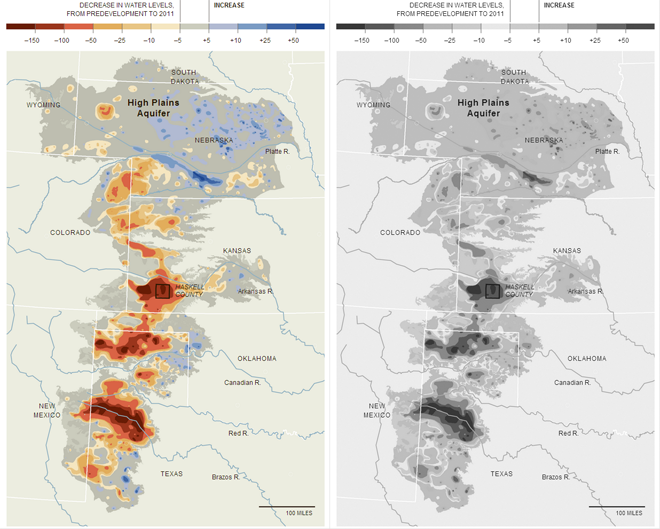
Rarely do I have criticism for infographics or pieces published by the New York Times, and admittedly this time I no longer have the original. However, in May, the Times published a map that was printed in black and white in their paper. I could not make heads or tails of what the map was attempting to say. I later found the online (and full-colour) version of the graphic. Because I no longer have the paper on me, I took the image and then discarded the colour information to simulate the effect.

One must always beware of the ultimate use of their designed work, be it an infographic or something else entirely. If one designs for digital, online display, he or she can rest relatively assured that colour will be available for their piece. However, in a black and white print environment, the colour here in a divergent palette fails to communicate the split between increases and decreases in aquifer levels. I would have expected a different palette or the use of patterns for the print version of this story.
Credit for the piece goes to the New York Times Graphics Department
Leave a Reply
You must be logged in to post a comment.