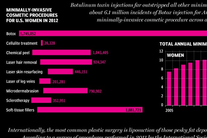
This Friday we look at plastic or cosmetic surgery. Because you should always feel better about yourself before the weekend begins. The work comes from the National Post and it looks at the popularity of specific types of surgeries for men and women over the last several years.

It’s a nice use of small multiples, line charts, and bar charts to explore the issue. I take issue with only one chart near the end of the piece. It looks at minimally invasive procedures and uses bar charts to compare the numbers. However, the bars do not sit on a common baseline and but for the addition of data labels, they would be useless in comparing the numbers of procedures.

Credit for the piece goes to Mike Faille and Richard Johnson.
Leave a Reply
You must be logged in to post a comment.