16 Useless Infographics

Happy Friday, everyone. Today’s post comes via colleagues of mine in London, who shared with me the Guardian’s selection of 16 useless infographics. They are shit infographics. Well, at least one is. Check them out and you’ll understand.
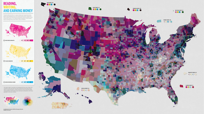
Using maps to explain maps…

Credit for the selection goes to Mona Chalabi. Credit for each infographic belongs to the infographic’s respective designer.

Author: Brendan Barry

I am a graphic designer who focuses on information design. My day job? Well, they asked me not to say. But to be clear, this blog is my something I do on my own time and does not represent the views of…my employers. I think what I can say is that given my interest in information design—be it in the shape of clear charts, maps, diagrams, or wayfinding systems—I am fortunate that my day job focuses on data visualisation. Outside of work, I try to stay busy with personal design work. Away from the world of design, I have become an amateur genealogist and family historian. You will sometimes see that area of work bleed into my posts.

Leave a Reply