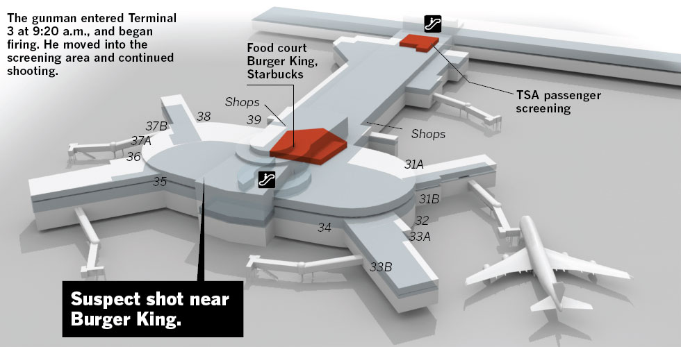
I didn’t see a lot of informative graphics regarding the shooting at LAX. But, here are two pieces. The first is from the Los Angeles TImes. Terminal 3 is rendered in three dimensions. Different buttons add views of the remainder of the airport.
The Washington Post opted for a flat, two-dimension drawing in one graphic with both all of LAX and Terminal 3 in the same graphic.
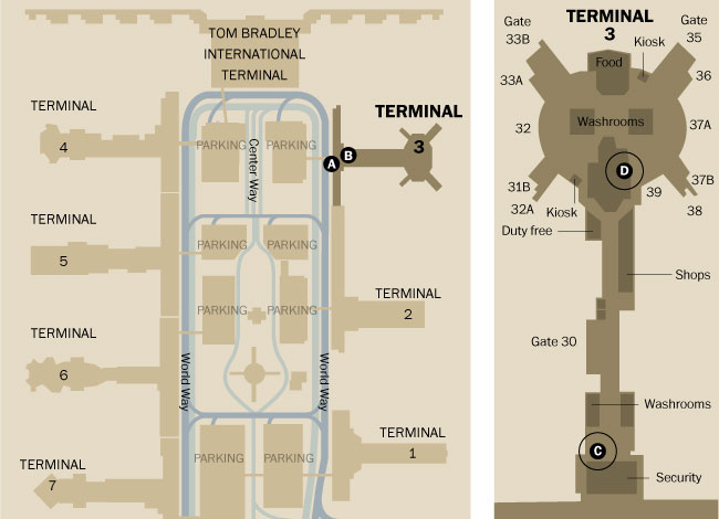
The thing about the three-dimensional rendering is that it adds too much complexity whereas the two-dimensional schematic strips most of it out. Is it important to know the specific details of a building? Or is it more important to see its general shape and an area inside of it?
Credit for the Los Angeles Times piece goes to Javier Zarracina, Raoul Ranoa, Lorena Iniguez, and Anthony Pesce.
Leave a Reply
You must be logged in to post a comment.