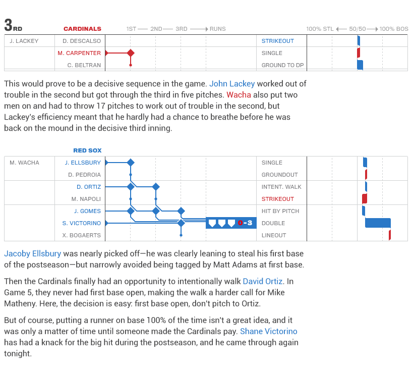
Last week the Boston Red Sox won the 2013 World Series. I did a wee bit of celebrating and so I did not have the chance to post today’s post until, well, today. A company called Statlas charted each game of the World Series. One of my coworkers pointed me in the direction of these visualisations, unfortuantely I missed out on most of them for the playoffs. Here, though, is when I started feeling a lot less nervous about Boston’s chances for winning Game 6.
There is a lot to see and look at in these games. And I will be curious to see where Statlas takes these—if they take them anywhere—for the 2014 season. Baseball is a game rich with statistics and data and teams and fans are increasingly using them to play and understand the play in the games. It’s about time somebody starts doing some valuable visualisations.
Credit for the piece goes to Statlas.
Leave a Reply
You must be logged in to post a comment.