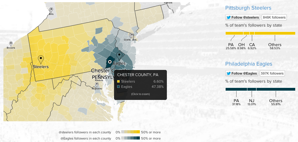
To continue with the sports theme from yesterday, today we have an interactive map from Twitter that looks at NFL team popularity. The methodology is simple, where are the users following the various football teams and map that out by county. The overall blog post features a country-wide map, but then narrows down into a few particular stories. The image below is from the divide in the state of Pennsylvania between Eagles fans and Steelers fans.
Credit for the piece goes to Simon Rogers and Krist Wongsuphasawat.
Leave a Reply
You must be logged in to post a comment.