Today’s post looks at peak income for the middle class. The Washington Post looked at peak median household income for each county in the United States. And for 81% of counties, that peak was over 15 years ago.
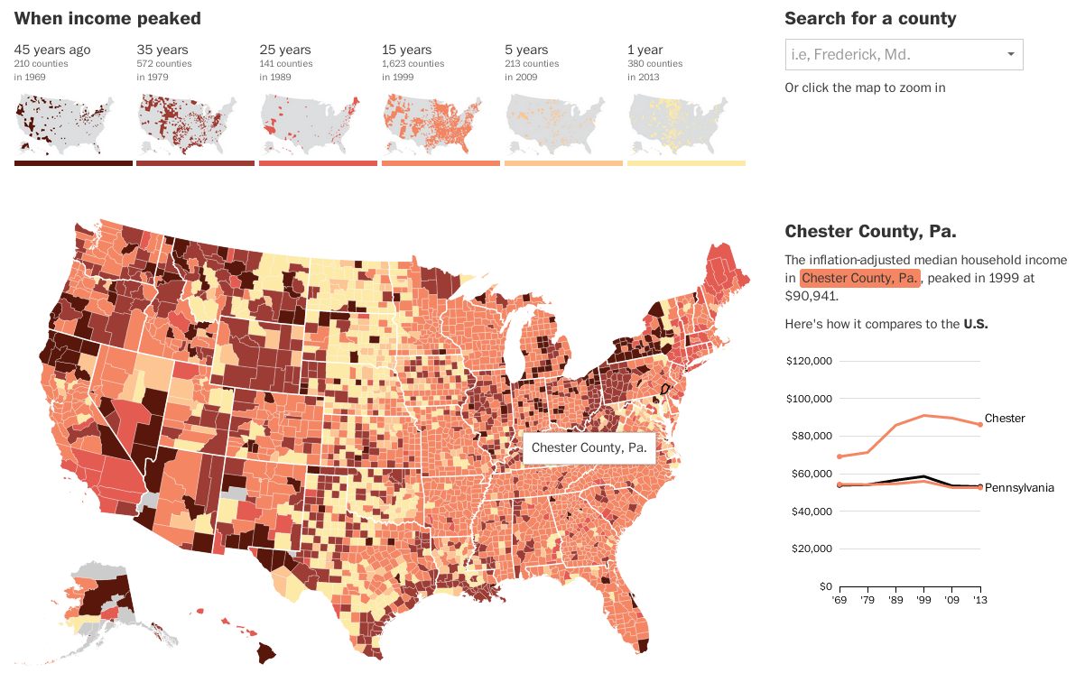
The really nice features of this piece are not actually the map, which is a standard choropleth map. Instead small multiples above the map breakdown the appearance of counties in each era bracket. And then to the right the user can compare a selected county against both the state and the United States. Overall, a very nice piece.
Credit for the piece Darla Cameron and Ted Mellnik.
Leave a Reply
You must be logged in to post a comment.