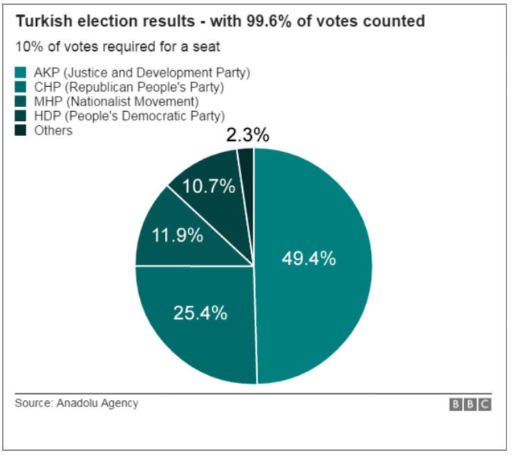
Turkey held its elections over the weekend. And so on the way to work this morning I decided to check the results on the BBC. And I saw this graphic—screenshot from my phone.
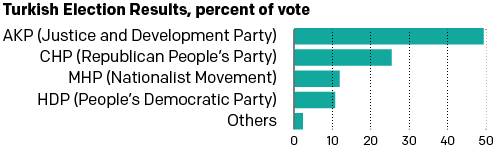
So I decided to scrap today’s blog post and instead spend all of five minutes tweaking this to make it a bit clearer. Or, a lot clearer. Simple little tweaks can make all the difference in data clarity. Now you can visually see the scale of difference in the votes. You also don’t need to refer to a legend off to the side with tints of the same colour.
Credit for the original piece goes to the BBC graphics department.
Leave a Reply
You must be logged in to post a comment.