Paul Ryan is about to takeover for John Boehner as Speaker of the House. So the Washington Post put together a nice graphic-featuring article about how Ryan compares to previous speakers—turns out he is fairly young. But the end of the piece uses this graphic to look at the number of days, i.e. experience, each speaker had prior to taking the role.
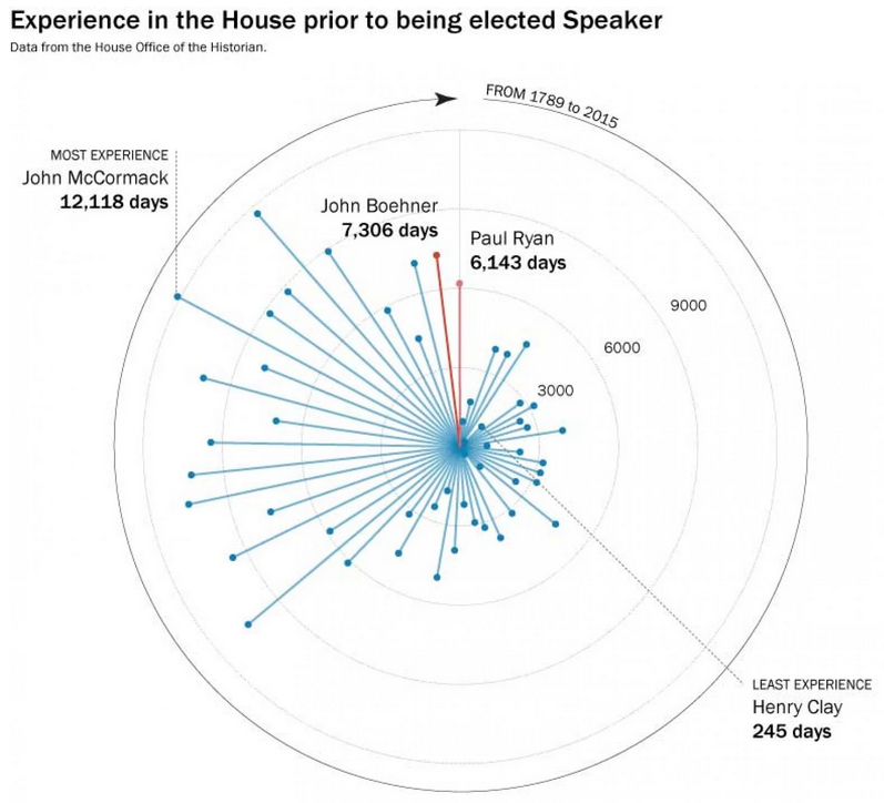
By putting the dots around a circle, the Post has created an interesting graphic. But the format makes it difficult to compare individuals who are not close together.
Credit for the piece goes to Philip Bump.
Author: Brendan Barry
I am a graphic designer who focuses on information design. My day job? Well, they asked me not to say. But to be clear, this blog is my something I do on my own time and does not represent the views of…my employers. I think what I can say is that given my interest in information design—be it in the shape of clear charts, maps, diagrams, or wayfinding systems—I am fortunate that my day job focuses on data visualisation. Outside of work, I try to stay busy with personal design work. Away from the world of design, I have become an amateur genealogist and family historian. You will sometimes see that area of work bleed into my posts.
View all posts by Brendan Barry