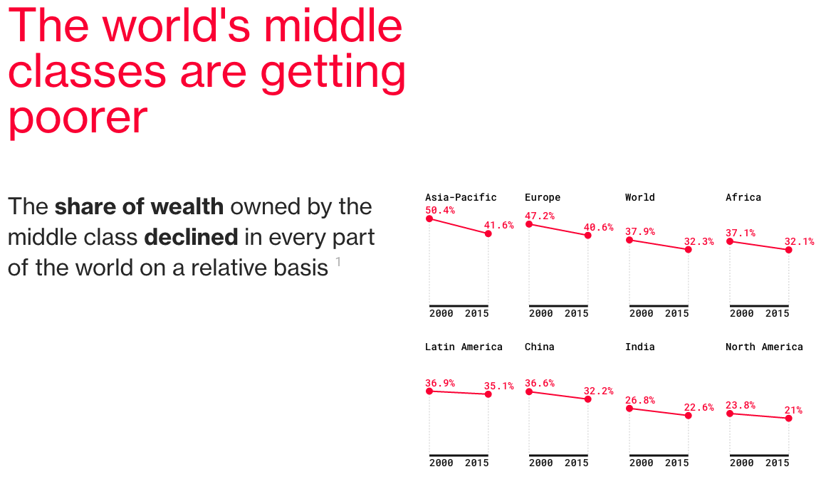
At least relatively speaking. Today’s post is a Bloomberg article comprised primarily of charts with pithy titles summarising the data story. If listicle is a word for articles consisting of the Top-10 things about [whatever], do we start embracing charticle as the word for chart-driven stories? Even if we do, we should take note that this piece was not the work of one person, but four.

The story captures my attention to and dovetails nicely into yesterday’s piece about a possible electoral path for Donald Trump to take the White House later this autumn.
Bonus points for the responsive nature of the post.
Credit for the piece goes to Andre Tartar, Mira Rojanasakul, Jeremy Diamond, and John Fraher.
Leave a Reply
You must be logged in to post a comment.