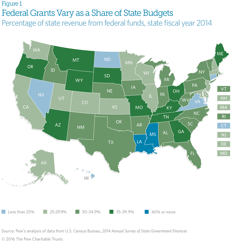
In politics, it is really easy and often popular to bash the federal government. Especially when it comes to its penchant for collecting taxes to pay for things. And sometimes those things are in other states than your own. But do you know how much federal money goes back to your own state? Well now you can thank the Pew Charitable Trusts for putting together this piece that explores what percentage of state budgets is comprised of federal grant money.

While the piece also includes a donut chart—because why not?—my biggest gripe is with the choropleth and the choice of colour for the bins. If you look carefully at the legend, you will see how both the lowest and highest bins use a shade of blue. That means blue represents states that receive less than 25% of their budget from federal grants and also states that receive more than 40% of their budget from the same federal grants. But if your state is between 25% and 40%, your state suddenly turns a shade of green. It really makes no sense. I think the same colour, either blue or green, could be used for the entire spectrum. Or, if the designers really wanted a divergent scheme, they could have used the national average and used that as the breakpoint to show which states are above and which are below said average.
Credit for the piece goes to the Pew Charitable Trusts graphics department.
Leave a Reply
You must be logged in to post a comment.