Plotting Cries for Help

So I thought I would be done with Harvey coverage, but this morning I saw this map from the New York Times that plotted out requests for aid throughout the storm.

You can really see the storm’s movement through the impacts upon the people. It’s especially true later in the timeline as the storm moved further to the east.

Early on the focus was in Houston

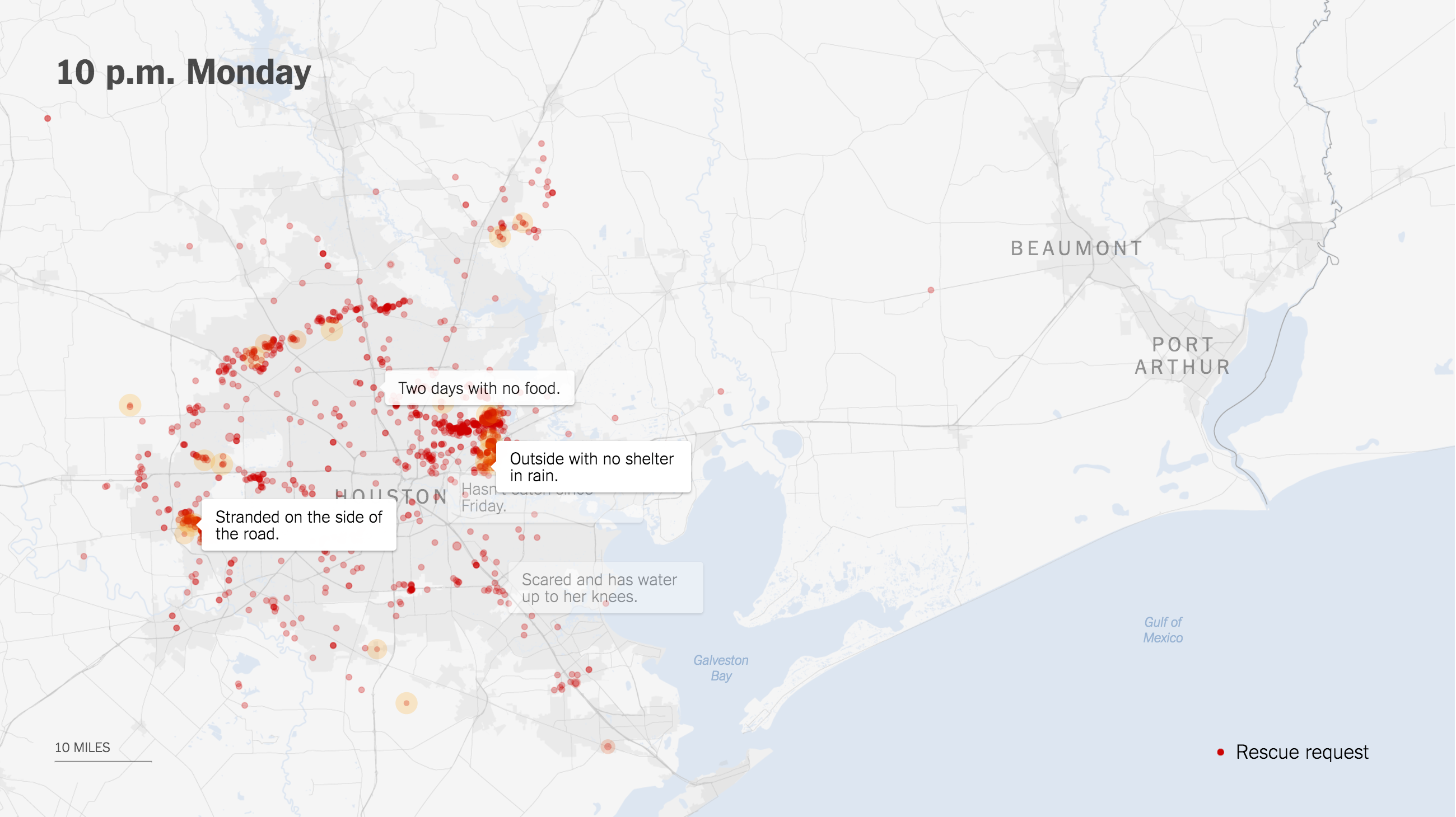
Credit for the piece goes to Gregor Aisch, Sarah Almukhtar, Jeremy Ashkenas, Matthew Bloch, Audrey Carlsen, Jose A. Delreal, Ford Fessenden, K.K. Rebecca Lai, Adam Pearce, Anjali Singhvi, and Karen Yourish.

Author: Brendan Barry

I am a graphic designer who focuses on information design. My day job? Well, they asked me not to say. But to be clear, this blog is my something I do on my own time and does not represent the views of…my employers. I think what I can say is that given my interest in information design—be it in the shape of clear charts, maps, diagrams, or wayfinding systems—I am fortunate that my day job focuses on data visualisation. Outside of work, I try to stay busy with personal design work. Away from the world of design, I have become an amateur genealogist and family historian. You will sometimes see that area of work bleed into my posts.

Leave a Reply