And I’m not talking about walking into a bar late at night. Instead, I am talking about the ratio of likes to retweets to replies, which, for those of you unfamiliar with the service, refers to engagement with a person’s tweets on Twitter.
The Ratio does not come from FiveThirtyEight—read the article for the full background on the concept, it is well worth the read—but they applied it to President Trump, whom we all know has a penchant for tweeting. The basic premise of the ratio is that you want more retweets and likes than replies. Think of it like customer reviews. Rarely do people bother to put the effort in to complement good service, but they will often write scathing reviews if something does not fit their expectations. Same in Twitter. If I do not care for what you say, I will let you know. But if I do, it is easy for me to like it, or even retweet it.
Anyway, the point is they took this and applied it to the tweets of Donald Trump and received this chart.
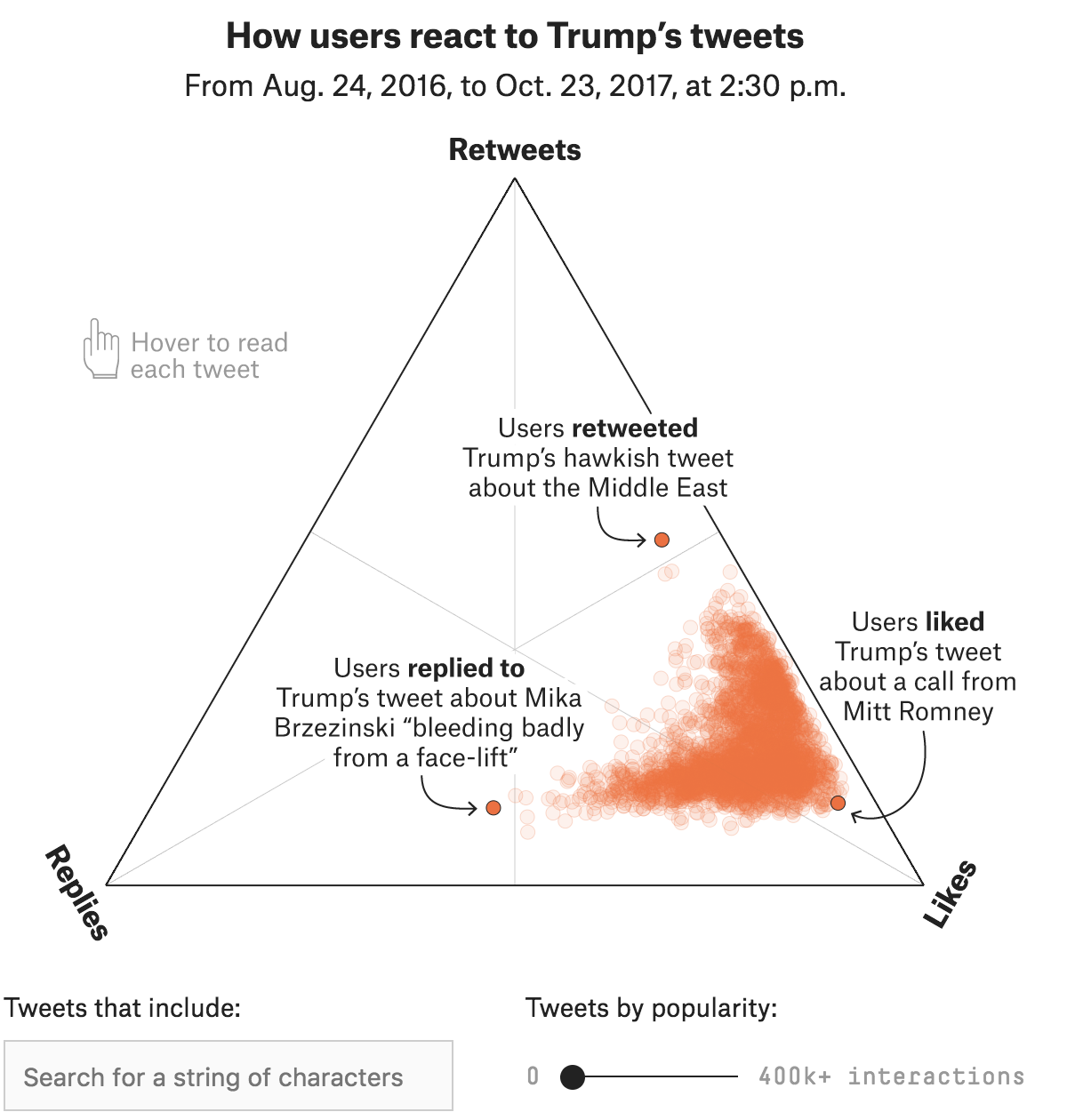
What I truly enjoy is the interactivity. Each dot reflects a tweet, and you can reveal that tweet by hovering over it. (I would be curious to know if the dots move. That is, do they, say, refresh daily with new tabulations on the updated numbers of likes, retweets, and replies?)
But the post goes on using the same chart form, in both other interactive displays and as static, small multiple pieces, to explore the political realm of previous tweeting presidents and current senators.
A solid article with some really nice graphics to boot.
Credit for the piece goes to Oliver Roeder, Dhrumil Mehta, and Gus Wezerek.
Leave a Reply
You must be logged in to post a comment.