This has been a busy week. I am working on a small piece on the Red Sox managers in the free agency period—I thought it would be ready yesterday, but not so much—but news continues to happen outside of the baseball world. Some of the biggest, at least in the US, would have to be the speech by Senator Flake of Arizona who announced he would not seek re-election in 2018.
So cue the politically-themed graphics. Today’s piece comes from the Washington Post. The graphic itself is not terribly complex as it is a scatter plot comparing the liberal/conservativeness of senators with how their respective state voted in 2016.
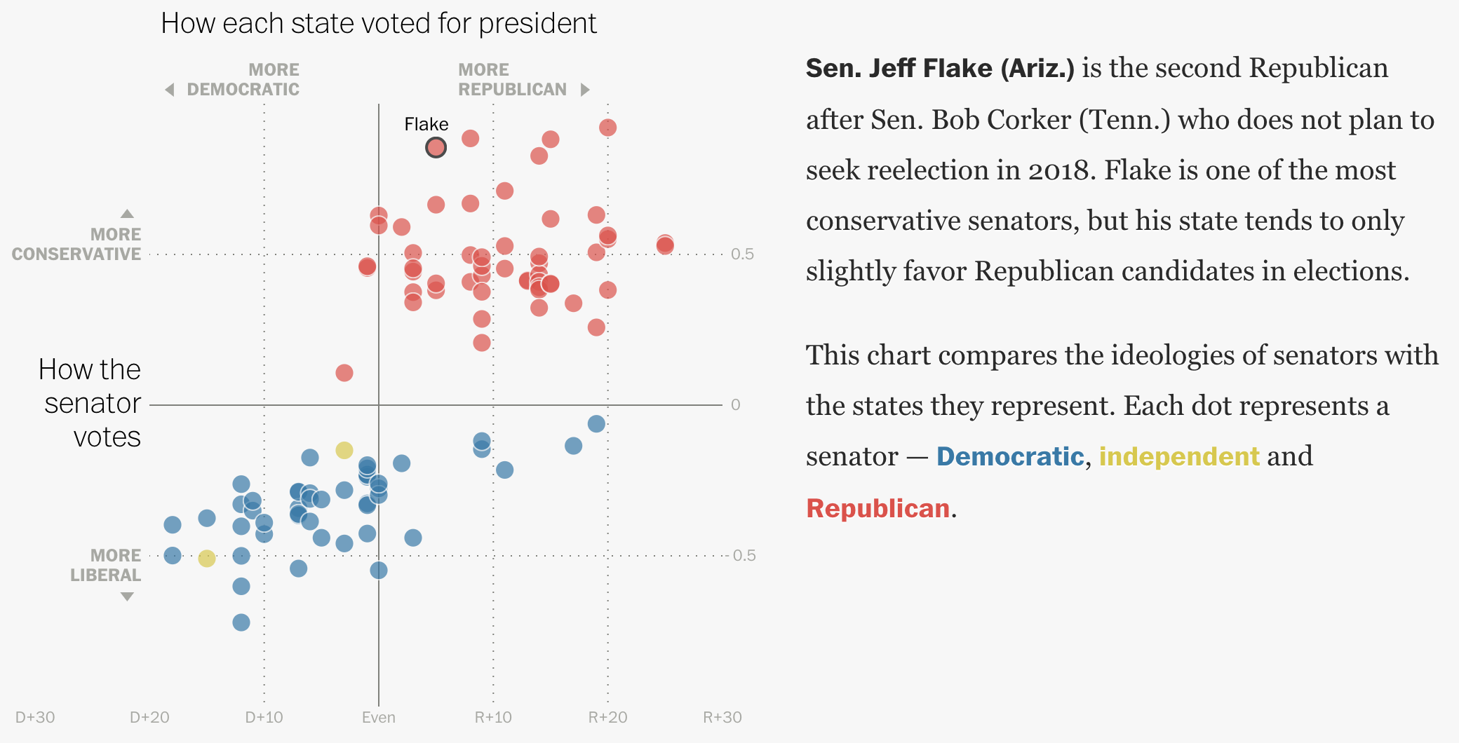
But what the piece does really well is weave a narrative through the chart. Scrolling down the page locks the graphic in place while the text changes to provide new context. And then different dots are highlighted or called out.
It proves that not all the best graphics need to be terribly complex.
Credit for the piece goes to Kevin Schaul and Kevin Uhrmacher.
Leave a Reply
You must be logged in to post a comment.