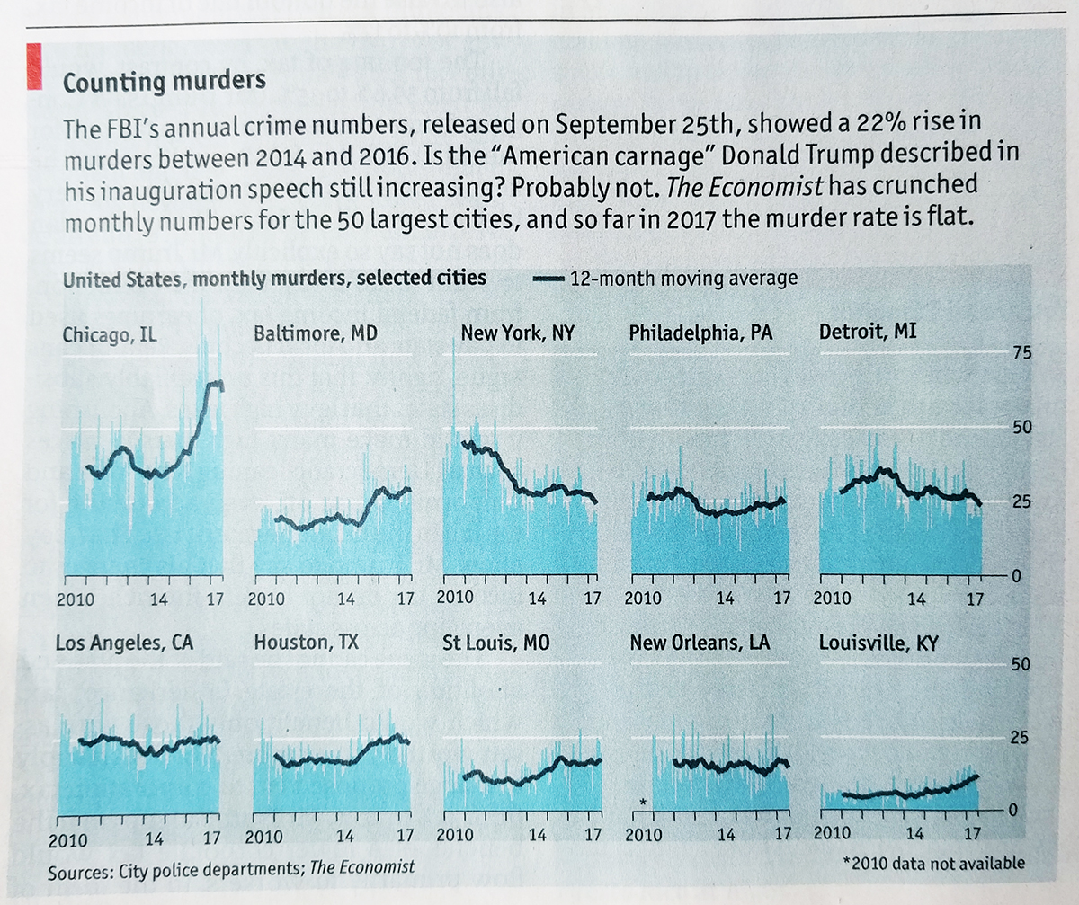
Yesterday we looked at an article about exporting guns from one state to another. After writing the article I sat down and recalled that the copy of the Economist sitting by the sofa had a small multiple chart looking at murders in a select set of US cities. It turns out that while there was a spike, it appears that lately the murder rate has been flat.
It’s a solid chart that does its job well. That is probably why I neglected to mention it until I realised it fit in with the map of Illinois and talk about gun crimes yesterday. Because there is plenty of other news through data visualisation that we can talk about this week.
Credit for the piece goes to the Economist Data Team.
Leave a Reply
You must be logged in to post a comment.