Well, the data speaks for itself. I wanted to use this screenshot, however, to show you the story because I think it does a fantastic job. Without having to read the article, the image encapsulates what is to come in the article.
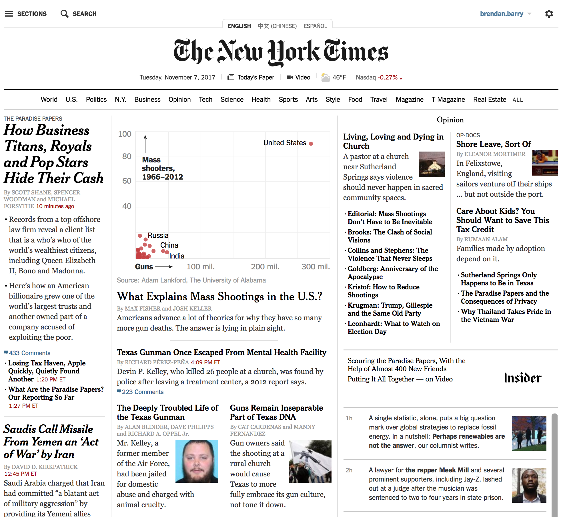
That said, there are a few other scatter plots worth checking out if the topic is of interest. And the explanation of the data makes all the more sense.
But I really loved the impact of that homepage.
Credit for the piece goes to Max Fisher and Josh Keller.
Leave a Reply
You must be logged in to post a comment.