School Shootings

The Wall Street Journal put together a nice piece about the uptick in elementary school shootings, both in the number of shootings and the number of deaths. It used two bar charts, regular and stacked, and a heat map to tell the story. The screenshot below is from a graphic that looks at the proportion of school shootings that occur at elementary schools. They are not as common, but as other graphics in the article show, they can be quite deadly.

Not a great trend…

The graphic above does a nice job of distilling the horror of a tragedy into a single rectangle. That is an important task because it allows us to detach ourselves and more rationally analyse the situation. Unfortunately the analysis is that yes, Virginia, things really have been getting worse.

Overall the article is simple but soberingly effective. School shootings are a problem with which American society has not dealt and my cynical side believes with which we will continue to not deal.

Credit for the piece goes to James Benedict and Danny Dougherty.

Kids Do the Darnedest Things: But Really They Do

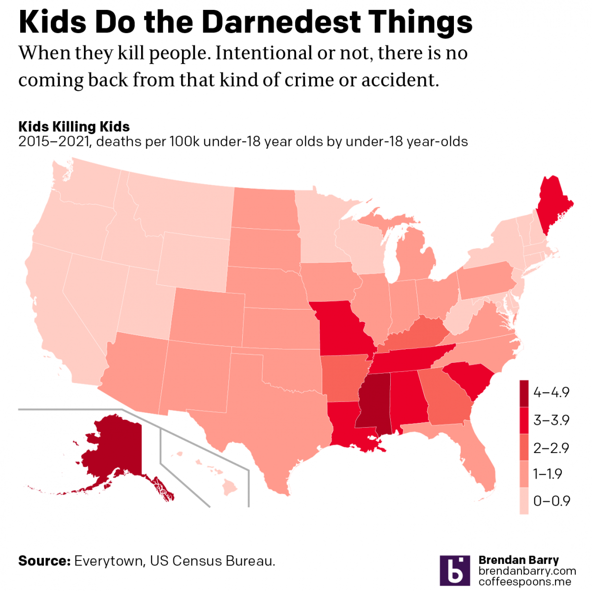
Remember how just last week I posted a graphic about the number of under-18 year olds killed by under-18 year olds? Well now we have an 18-year-old shooting up an elementary school killing 19 students and two teachers. Legally the alleged shooter, Salvador Ramos, is an adult given his age. But he was also a high-school student, reportedly more of a loner type. Legally an adult, perhaps, but I’d argue still more of a child. At least a young adult.

Well, as I noted above, here we are again, kids killing kids. With guns!

And it does look like it correlates with those state with more liberal gun laws, including Texas.

If you keep doing the same thing, but expect different results…

Credit for the piece is mine.

Kids Do the Darnedest Things: Shoot Other Kids

Last month, a 2-year old shot and killed his 4-year old sister whilst they sat in a car at a petrol station in Chester, Pennsylvania, a city just south of Philadelphia.

Not surprisingly some people began to look at the data around kid-involved shootings. One such person was Christopher Ingraham who explored the data and showed how shootings by children is up 50% since the pandemic. He used two graphics, one a bar chart and another a choropleth map.

The map shows where kid-involved shootings have occurred. Now what’s curious about this kind of a map is that the designer points out that toddler incidents are concentrated around the Southeast and Midwest. And that appears to be true, but some of the standouts like Ohio and Florida—not to mention Texas—are some of the most populated states in the country. More people would theoretically mean more deaths.

So if we go back to the original data and then grab a 2020 US Census estimate for the under-18 population of each state, I can run some back of the envelope maths and we can take a look at how many under-18 deaths there had been per 100,000 under-18 year-olds. And that map begins to look a little bit different.

If anything we see the pattern a bit more clearly. The problem persists in the Southeast, but it’s more concentrated in what I would call the Deep South. The problem states in the Midwest fade a bit to a lower rate. Some of the more obvious outliers here become Alaska and Maine.

As the original author points out, some of these numbers likely owe to lax gun regulation in terms of safe storage and trigger locks. I wonder if the numbers in Alaska and Maine could be due to the more rural nature of the states, but then we don’t see similar rates of kid deaths in places like Wyoming, Montana, and Idaho.

Credit for the original piece goes to Christopher Ingraham.

How Mass Shootings Have Changed

A few weeks ago here in the United States, we had the mass shootings in El Paso, Texas and Dayton, Ohio. The Washington Post put together a piece looking at how mass shootings have changed since 1966. And unfortunately one of the key takeaways is that since 1999 they are far too common.

The biggest graphic from the article is its timeline.

Getting worse over time

It captures the total number of people killed per event. But, it also breaks down the shootings by admittedly arbitrary time periods. Here it looks at three distinct ones. The first begins at the beginning of the dataset: 1966. The second begins with Columbine High School in 1999, when two high school teenagers killed 13 fellow students. Then the third begins with the killing of 9 worshippers in a African Episcopal Methodist church in Charlestown, South Carolina.

Within each time period, the peaks become more extreme, and they occur more frequently. The beige boxes do a good job of calling out just how frequently they occur. And then the annotations call out the unfortunate historic events where record numbers of people were killed.

The above is a screenshot of a digital presentation. However, I hope the print piece did a full-page printing of the timeline and showed the entire timeline in sequence. Here, the timeline is chopped up into two separate lines. I like how the thin grey rule breaks the second from the third segment. But the reader loses the vertical comparison of the bars in the first segment to those in the second and third.

Later on in the graphic, the article uses a dot plot to examine the age of the mass shooters. There it could have perhaps used smaller dots that did not feature as much overlap. Or a histogram could have been useful as infrequently used type of chart.

Lastly it uses small multiples of line charts to show the change in frequency of particular types of locations.

Overall it’s a solid piece. But the timeline is its jewel. Unfortunately, I will end up talking about similar graphics about mass shootings far too soon in the future.

Credit for the piece goes to Bonnie Berkowitz, Adrian Blanco, Brittany Renee Mayes, Klara Auerbach, and Danielle Rindler.

United in Gun Control

Today’s piece is nothing more than a line chart. But in the aftermath of this past weekend’s gun violence—and the inability of this country to enact gun control legislation to try and reduce instances like them—the Economist published a piece looking at public polling on gun control legislation. Perhaps surprisingly, the data shows people are broadly in favour of more restrictive gun laws, including the outlawing of military-style, semi-automatic weapons.

These trendlines are heading in the right direction

In this graphic, we have a line chart. However the import parts to note are the dots, which is when the survey was conducted. The lines, in this sense, can be seen as a bit misleading. For example, consider that from late 2013 through late 2015 the AP–NORC Centre conducted no surveys. It is entirely possible that support for stricter laws fell, or spiked, but then fell back to the near 60% register it held in 2015.

On the other hand, given the gaps in the dataset, lines would be useful to guide the reader across the graphic. So I can see the need for some visual aid.

Regardless, support for stricter gun laws is higher than your author believed it to be.

Credit for the piece goes to the Economist graphics department.

Which of These Countries Does Not Belong

For those of you reading from the States, I hope you all enjoyed your holiday. And for my UK readers, I hope you all enjoyed your summer bank holiday last weekend. So now to the good and uplifting kind of news.

Something is clearly not right here.

Indeed, a chart about deaths from firearms from the Economist. From a graphical standpoint, we all know how much I loathe stacked bar charts and this shows why. It is difficult for the user to isolate and compare the profiles of certain types of firearm violence against each other. Clearly there are countries where suicide by gun is more prevalent than murder, but most on this list are more murder happy.

And then the line chart that is cleverly spaced within the overall graphic, well, it falls apart. There are too many lines highlighted. Instead, I would have separated these out into a separate chart, made larger, so that the reader can more easily discern which series belongs to which country. Or I would have gone with a set of small multiples isolating those nine countries.

I am also unclear on why certain countries were highlighted in the line chart. Did they all need to be highlighted? Why, for example, is Trinidad & Tobago. It is not mentioned in the article, nor is it in the stacked bar chart.

But the biggest problem I have is with the data itself. But, every one of the countries on that list is among the developing countries or the least developed countries. Except one. And that, of course, is the United States.

Credit for the piece goes to the Economist Data Team.

State Level Action on Gun Control

A few months ago I covered an editorial piece from the New York Times that looked at all the action, by which I mean inaction, the federal government had taken on gun violence in the wake of some horrific shootings. Well on Saturday the Washington Post published an article looking at how there has been action on the state level.

Where is Pennsylvania?

It used a series of small multiple maps of the United States with states represented as tiles or boxes. States are coloured by whether they took action in one of six different categories. It is a pretty simple and straightforward design that works well.

The only thing I am unsure about is whether the colours are necessary. A single colour could be used effectively given that each map has a clear title directly above it. Now, if the dataset were to be used in another chart or graphic alongside the maps where the types of action were combined, then colours could be justified. For example, if there was a way to see what actions a state had taken, i.e. pivot the data display, the different colours could show what from the set the state had done.

And in Pennsylvania’s case, sadly, that is nothing.

Credit for the piece goes to Amber Phillips.

Gun Control Legislation

Back in March I posted about a great graphic from the New York Times editorial board they made in the wake of the Parkland, Florida school shooting. Saturday morning, the day after Friday’s Santa Fe, Texas school shooting, I was reading the paper and found the updated graphic.

That is a whole lot of months since Sandy Hook…

Yeah, almost nothing has changed. Congress passed and the president signed an omnibus spending bill that included language to improve reporting on background checks.

Yeah.

Now from a design standpoint, what’s nice about this graphic is its restrained use of colour. The whole piece works in black and white. Of course it helps that there is nothing to show that needs to be highlighted in the data.

Yeah.

Credit for the piece goes to the New York Times graphics department.

When No Change or Growth Is the Story

For many years I would often tell people that sometimes a visualisation can be “boring”, because the data itself is boring—a lack of growth in a market, no real mergers, or even steady and consistent but unspectacular growth. Those can all be stories, even if they likely result in very monotone choropleths or straight line charts or perfect steps of bar charts.

And then there are times when the lack of growth or change, when visualised, can be very powerful. I wanted to share this piece from the New York Times with everyone because it does just that.

Starting from the Sandy Hook Massacre and moving through to Parkland

You really need to click through and see the scale and scope, because the designers behind this did a fantastic job of capturing that sense of lack of change in a very large and expansive piece.

Credit for the piece goes to the New York Times Editorial Board.

More Murder in Merica

Today’s post was going to be something not this. But it is remarkable how many people die in the United States in mass shootings. It is, generally speaking, not a problem experienced in the rest of the developed world. The question is do we want gun violence to really define American exceptionalism?

Anyways, the Washington Post has a frightening piece exploring all the deaths, the guns, the killers, and the frequency of the killings.

Too many illustrations there

Credit for the piece goes to Bonnie Berkowitz, Denise Lu, and Chris Alcantara.