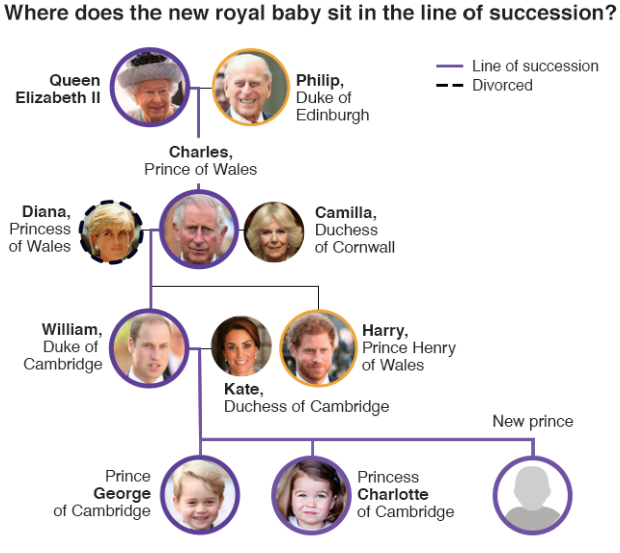
When I woke up this morning, the BBC was reporting that the Duchess of Cambridge was in labour. Clearly by the time I sat down to write today’s blog post, she gave birth to the child, a boy. And so now we have this graphic from the BBC showing how the new child fits into the line of succession to the British throne.

In all likelihood, the BBC had this graphic prepared well in advance. And once the child’s name is announced, it can be rapidly updated to include that additional information.
An interesting quirk I wanted to point out was the graphic’s use of orange. The graphic clearly shows how purple is used for the line of succession (and the dotted lines for divorce). But, what about the two orange circles, one for Philip, Duke of Edinburgh, and the other Prince Harry? Interestingly, those two are both in the line of succession as well, just not directly.
For example, Harry becomes monarch only if William and his children all die without heirs. But we all sort of knew that. Philip, on the other hand, is a few hundred down on the list, but is himself also eligible. Though the odds of that happening are so remote it’s a wonder it was put on the graphic. But still a neat little piece of trivia.
Credit for the piece goes to the BBC graphics department.
Leave a Reply
You must be logged in to post a comment.