On Monday I read, in print, part of a page one article in the Times. I ran out of times given the whole new royal baby coverage, and opted to read the rest digitally. Originally, this was just for my own enjoyment as there were no graphics in the article.
But this one appeared online.
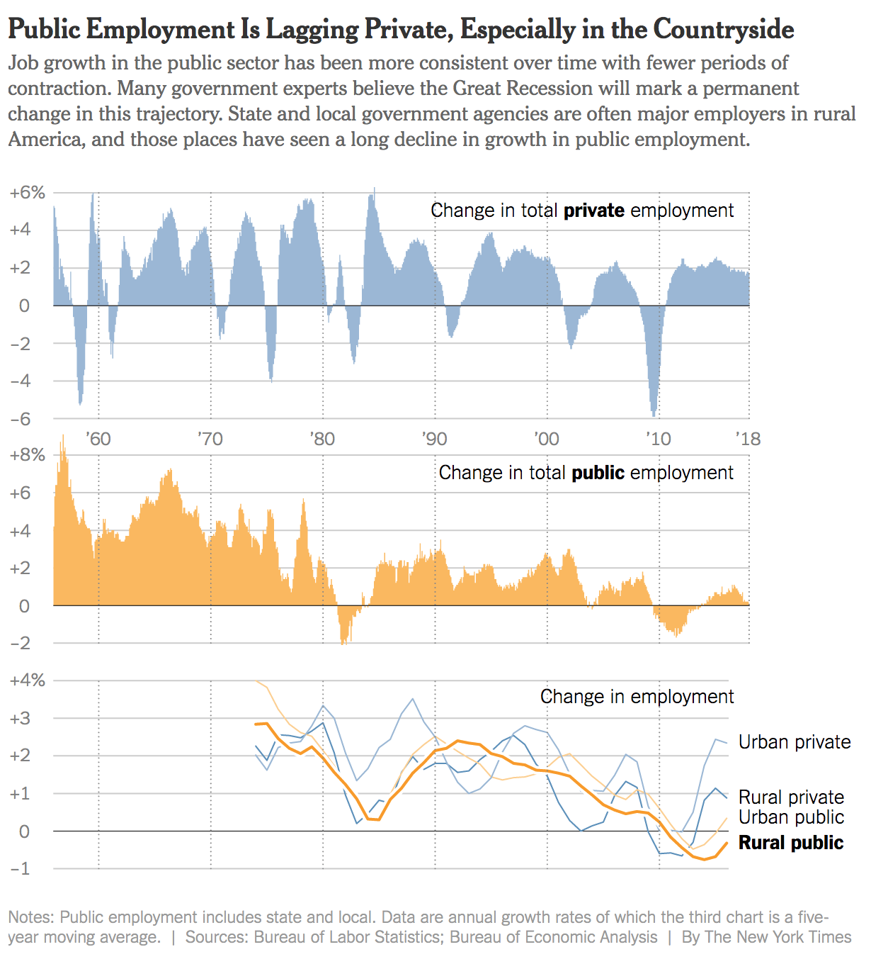
I clearly have nothing to compare it to in print, which is a shame because this is a nice graphic with one thing I really wanted to point out. Although, maybe a print version would not have had the thing I will get to. But maybe there just wasn’t space in the print edition or they tried to make it work, but the colours or layout wasn’t working. Who knows.
When I saw the digital version, the line chart struck me as particularly nice. Now, maybe the Times has been doing this for a little while and I have missed it, but notice the highlighted line, Rural public. Yes the line is thicker or bolder than the others, but more importantly it has a thin white stroke attached that helps separate it from the lines behind it. Those lines are important for context, but not necessarily to tell the story of how rural public servant jobs have been hit the hardest.
You often see this kind of approach taken with maps. Don’t believe me? Take a look at Google Maps as one example. Their text often has a thin white outline to make it stand out from the content of the map. I just have never seen the logic applied to a line chart.
I doubt the design would hold up in a number of other scenarios. For example, a straight line chart with no line highlighted in particular, the spaghetti-ness mess would make the above a largely white line chart. Too much overlap. And a simple comparison, say of two lines, probably is clear enough that the approach is not necessary. But in scenarios like these where the highlighted series is important, the choice clearly works.
On a much smaller note, check out the x-axis labels. They are used only once for the first chart. And then because the bar charts and line charts align, they carry through straight down the rest of the piece. Very efficient.
I only wish I knew how this would have appeared in print…
Credit for the piece goes to the New York Times graphics department.
Leave a Reply
You must be logged in to post a comment.