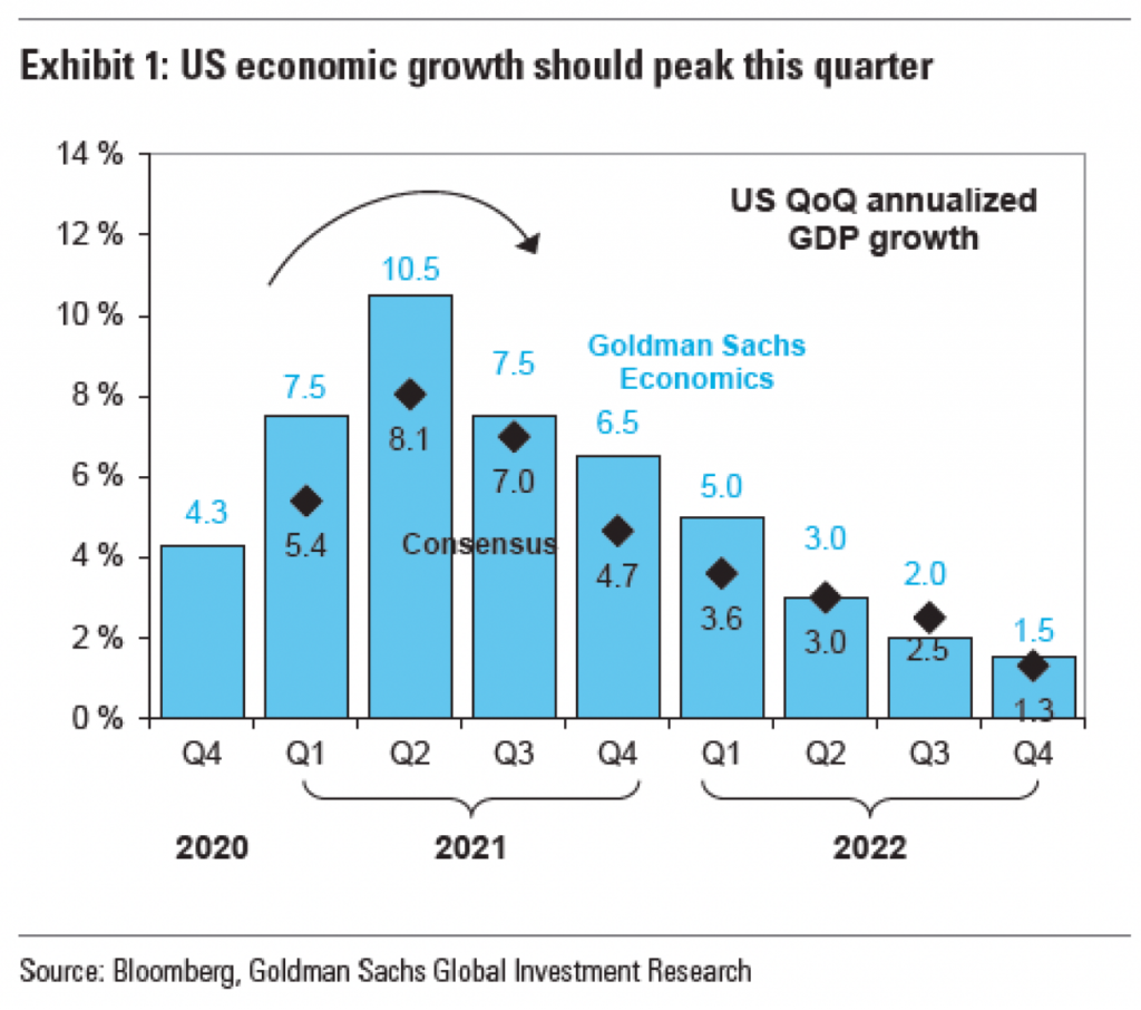
I don’t know if this is a trend, but I’ve now seen a few graphics appearing using arrows to show the direction or trend of the data. This graphic in an article by Bloomberg prompted me to talk about this piece.
I should add, after rereading my draft, that I’m not clear who made this graphic. I assume that it was the Bloomberg graphics team, because it appears in Bloomberg and all the data is presented to recreate the chart. But, it could also be a chart made by someone at Goldman Sachs that credits Bloomberg as a source and then someone at Bloomberg got hold of a copy. And a graphic made for a news/media outlet will typically be of a different quality or level of polish than one made perhaps by and for analysts. (Not that I think there should be said differences, as it does a disservice to internal users, but I digress from a digression.)

The arrow here appears above the peak quarter, i.e. the second of 2021, for both the Goldman Sachs Economics forecast and the consensus forecast. But what does it really add? First, it adds “ink”, in this case pixels. Here, every pixel consumes our attention and there is a finite number of available pixels within the space of this graphic.
When I work with authors or subject matter experts, I often find myself asking them “what’s the most important thing to communicate?” or something along those lines. If the person answers with a long laundry list, I remind them that if everything is important, nothing is important. If everything is set in bold, all caps text, what will look most important is the rare bit of text set in regular, lower-case letters.
In the above graphic, there are so many things screaming for my attention, it’s difficult to say which is the most important. First, I’m fairly certain that “US QoQ annualised GDP growth” could move to the graphic subhead or data definition. Allow the graphic’s data container to contain, well, data. Second, the data series labels can be moved outside the data container. The labels here have an inherent problem is that the Goldman Sachs Economics numbers are in blue, and that blue text has less visual weight than the black text of the Consensus label. Consequently, the Goldman Sachs Economics label recedes into the background and becomes lost, not what you want from your legend.
Third, I don’t believe the data labels here add anything to the chart. They function as sparkly distractions from the visual trend, which should be the most important aspect of a visual chart.
Finally, we get to the arrow, the impetus for this post. First, I should note that it is not clear what growth it shows. The fact the line is black makes me think it reflects the Consensus forecast whereas a blue line would represent the Goldman Sachs forecast. But it could also be the average of the two or even a more general “here’s the general shape”. The problem is that the shape matters. If you look at the slope of the actual forecasts, you see a sharp increase to the peak followed by a slower, more gradual taper. The arrow in the original graphic shows a decelerating curve that is shallower in the lead up to the peak and that is not what is forecast to happen.
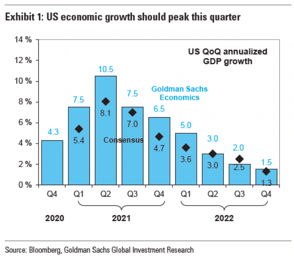
Now we get to the issue I mentioned at the top, the extraneous labelling and data ink wasted. If we look at the chart as is, but remove the arrow, we see this.

Immediately to the right of the peak, we have have some blue data labels and then just a bit to the right of that, but sitting vertically above the label we have the bold blue text labelling the data series. But further to the upper right we have a dark and bold block of text that draws the eye away from the peak and into the corner. It draws the eye away from the very element of the shape the peak needs to be a peak, the trough in the wave. Consequently, it makes sense with the eye being drawn up and to the right that the designers threw an arrow in above the peak to show how, no, actually your eye needs to go down and to the right.
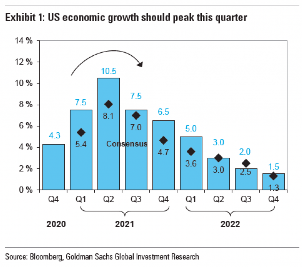
But what happens if we then strip out the data series labelling? Do we still need the arrow? Let’s take a look.

I would argue that no, we do not. And so let’s strip the arrow out of the picture and take a look.

Here the shape of the curve is clear, a sharp rise and then a gradual taper to the right. No arrow needed to show the contour. In other words, the additional labelling wastes our attention, which then forces us to add an arrow to see what we needed to see in the first place, but then further wasting our attention.
There are a number of other things I take issue with in this chart: the black outlines of the blue rectangles, the tick marks on the x-axis, the solid border of the container, the lack of axis lines. But the arrow points to this graphic’s central problem, a poorly thought out labelling structure.
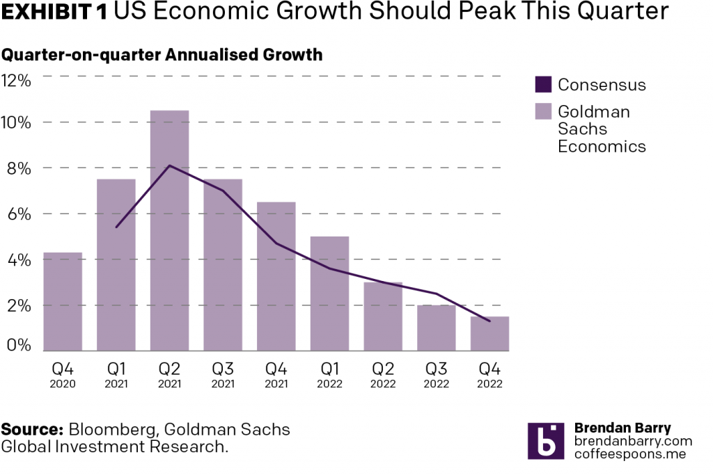
So because the chart provides all the data, I took a quick stab at how I would chart it using my own styles. I gave myself a 3:2 ratio, less space than the original graphic had. This is where I landed. I would prefer the legend below the chart labelling, but it felt cramped in the space. And with so few data points along the x-axis, the chart doesn’t need a ton of horizontal space and so I repurposed some of it to create a vertical legend space.
I mixed typefaces only because my default does not have a proper small capitals and I wanted to use small capitals to reduce and balance out the weight of the exhibit label in the graphic title.

I could still tweak the spacing between the bars and perhaps the treatment of the years below the quarters could use some additional work, but the main point here is that the shape of the curve is clear. I need no arrow to tell the user that there is a peak and that after the peak the line goes down. The white space around the bars and the line does that for me.
Credit for the piece goes to either the Bloomberg graphics department or the Goldman Sachs graphics department. Not sure.
Leave a Reply
You must be logged in to post a comment.