And by out there I mean 1150 light years away. One of the five amazing images out of the first day’s announcement by the James Webb Space Telescope (JWST) team was not a sexy photo of a nebula or a look back 13.5 billion years in time. Instead it was a plot of the amount of infrared light was blocked as exoplanet WASP-96b, a hot Jupiter, transited in front of its sun. A hot Jupiter is a gas giant roughly the size of Jupiter that orbits its sun so closely—often closer than Mercury does our Sun—its year takes mere days. WASP-96b is about half the mass of Jupiter and a year takes a little over three Earth days. Hot indeed.
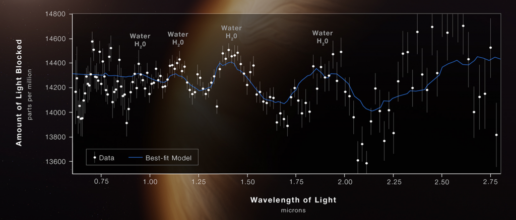
The JWST means not just to take those images we saw, but to also capture data about the light passing through planetary atmospheres, just like WASP-96b. And showing the world Tuesday just how that works was a brilliant idea. What they shared was this graphic.

The original post explains the science behind it, but in short we see telltale signs of water vapor in the atmosphere. Remember that the planet is far too hit for liquid water to exist. But because the peaks and troughs were not as pronounced as expected, scientists can conclude that there are clouds and haze in the atmosphere. It did not detect any significant signs of oxygen, carbon dioxide, or methane, all of which would be noticeable if present as we expect in future exoplanets to be studied.
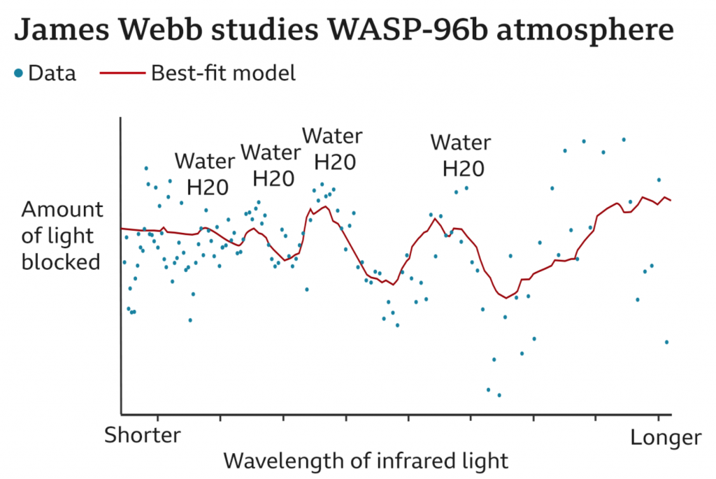
But later that day, the BBC published an article summarising the releases, but included a different version of the above graphic. Though the other four photos were unchanged. The BBC presented us with this.

The most notable difference is the background. What was a giant illustration of a planet and then a semi-transparent chart background atop that on which the graphic sat is here replaced by a simple white background. Off the bat this chart is easier to read.
But then here we also lose some data clarity. Note on the original how we have axis markers for the wavelengths of light and the parts per million of light blocked. All are absent here. Instead the BBC opted to only put “Shorter” and “Longer” on the wavelength axis. I would submit that there was no real need to remove those labels, but that they could have been added to with these new ones. The new labels certainly explain the numbers to an audience that may not be as scientifically literate as perhaps the JWST’s audience was or was thought to be. There is certainly a value to simplifying and distilling things to a level at which your audience can understand. But there’s also a value in presenting more complex data, issues, and ideas in an attempt to educate and elevate your audience. In other words, instead of always trying to play to the lowest common denominator, it sometimes is worth it to lose a few in the audience if you ultimately increase the level of said denominator overall.
The other notable difference is that the data is presented without what I assume to be plots of the range of observations with their respective medians. You can see this in the original by how every wavelength has a line and a dot sitting in the middle of that line. In other words, over the 6+ hours the planet was observed, at each wavelength a certain amount of light was blocked. The average middle point over that whole time period is the dot. Then a line of best fit “connects” the dots to show the composition of the light streaming though that steamy atmosphere.
Again, I can understand the desire to remove the ranges and keep the median, but I also think that there is little harm in showing both. Though, the first graphic could like have used an explanation of what was shown, as I’m only assuming what we have and I could be way off. You can show more things and raise the level of the denominator, but you can only do so if you explain what your audience is looking at.
Overall both graphics are nice and capture not just the particular makeup of this one exoplanet’s atmosphere, but more broadly the potential power of the JWST and its impact on astronomy.
Credit for the original goes to the NASA, ESA, CSA, and STScI graphics teams.
Credit for the BBC version goes to the BBC graphics department.