Tag: box plot
-
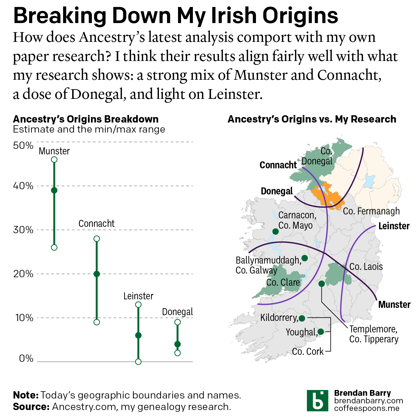
Still Irish
Last October Ancestry.com updated their ethnic origins breakdowns. Longtime readers will know these are not the most useful tools for helping one in their genealogical research. But, if they garner interest in one’s family history and motivate people to explore their own pasts, more power to them. I only encourage those people to dig a…
-
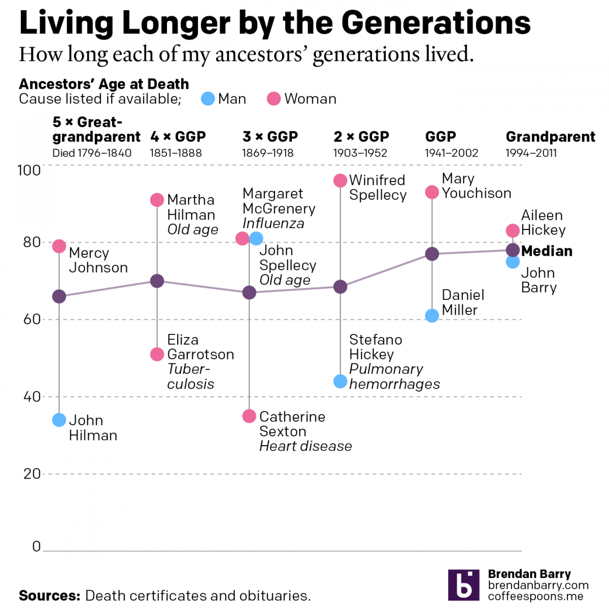
Living Longer by the Generations
Last weekend was Easter—for both the Catholics and the Orthodox—and I visited the Appalachian ancestral home of the Carpatho–Rusyn side of my family. Before leaving town I drove up to the old cemetery on a hill overlooking the old church and the Juniata River to pay my respects to those who came before me and…
-
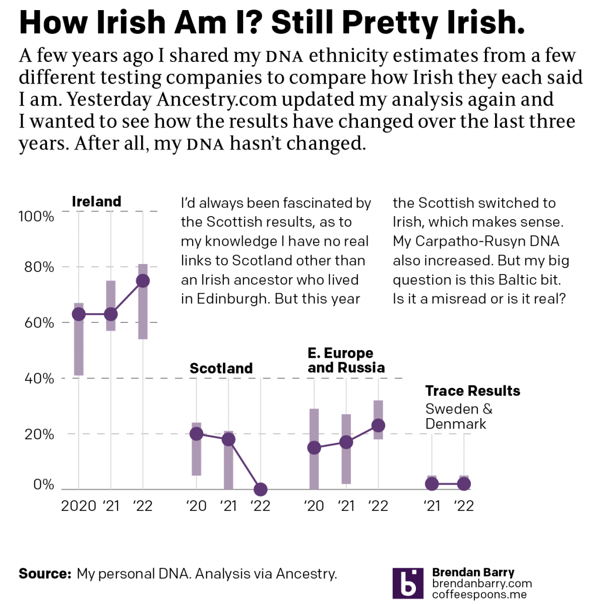
No Matter What You Say, I’m Still Me
As many long-time readers know, I was long ago bitten by the genealogy bug and that included me taking several DNA tests. The real value remains in the genetic matches, less so the ethnicity estimates. But the estimates are fun, I’ll give you that. Every so often the companies update their analysis of the DNA…
-
It’s a Little Steamy Out There
And by out there I mean 1150 light years away. One of the five amazing images out of the first day’s announcement by the James Webb Space Telescope (JWST) team was not a sexy photo of a nebula or a look back 13.5 billion years in time. Instead it was a plot of the amount…
-
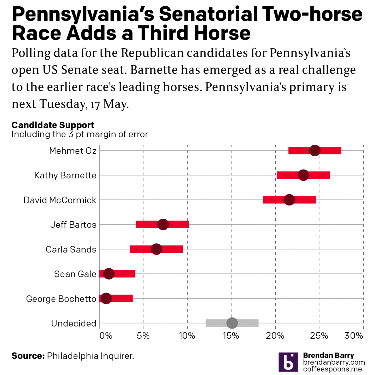
Political Hatch Jobs
Earlier this week I read an article in the Philadelphia Inquirer about the political prospects of some of the candidates for the open US Senate seat for Pennsylvania, for which I and many others will be voting come November. But before I get to vote on a candidate, members of the political parties first get…
-
Updated DNA Ethnicity Estimates
Earlier this year I posted a short piece that compared my DNA ethnicity estimates provided by a few different companies to each other. Ethnicity estimates are great cocktail party conversations, but not terribly useful to people doing serious genealogy research. They are highly dependent upon the available data from reference populations. To put it another…
-
Covid-19 Is Not the Flu Part Augh!
Yesterday, President Trump once again lied to the American public on his social media platforms. He falsely claimed that Covid-19 was nothing worse than the flu, which he falsely claimed sometimes kills more than 100,000 people. Once again we are going to look at the data comparing influenza to the novel coronavirus and the disease…
-
The Climate Impact of Your Food
Climate change is a thing. And facing it will require a lot of our societies. But the longer we choose not to act, the more the impact will be felt by later generations. Consequently, across the world, young students have been walking out of class to shine light on an issue on which they, as children,…
-
Infinite Errors
Information design has largely settled on a few key forms to communicate data. One is the error bar. But xkcd explores what can happen when we take error bars…to infinity. Credit for the piece goes to Randall Munroe.
-
How Good Does Blue Taste?
My apologies, everyone, I have been having technical difficulties this week. (Of all weeks, right?) Anyway, it’s Friday. We can save the 24 million fewer Americans insured under Trumpcare until next week, right? Credit for the piece goes to Randall Munroe.