Last week the BBC published a look at the new White House ballroom promised by President Trump. The ballroom required demolishing the existing East Room. Instead of focusing on the legality of the move, I want to focus on the ever increasing cost of the project. The article does include a great before/after photograph of the former East Room site and the mess that is there today.
Instead, I want to focus on another graphic the BBC created, which explored the number of mentions on Truth Social that they annotated to include costs.
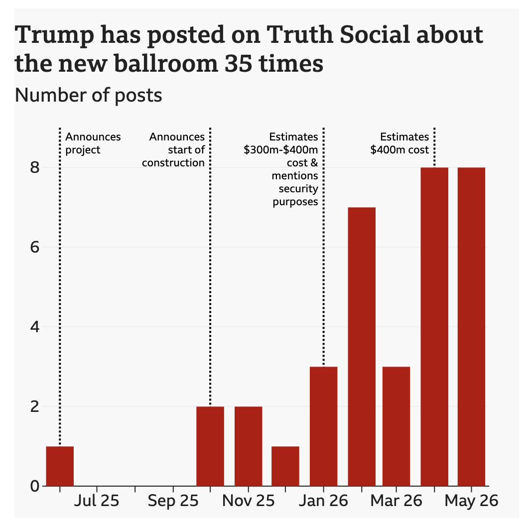
This graphic charts number of mentions and annotates those with some key context.
But I wonder if the data exists to chart the stated costs of the project. I do not have the time to actually analyse the Truth Social posts, so this is not an actual graphic, but if it were along the lines of how the story and the graphic talks about the costs, I would not be surprised if it looked something like this.
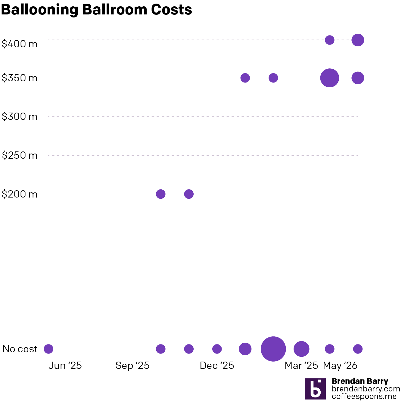
Here the y-axis charts the price tag and the size of the dot the number of mentions. Area in these types of charts are not an ideal measurement because the human eye is not great at comparing sizes, especially compared to placement/length on an axis. But the x-axis is the timeline, which here is important in its own right with an increasing number of mentions over time.
Ideally, I would have real dates and actual costs vs. no costs mentioned data. I do think long-term something like this would be possible. Because, if it is anything like I suspect how it would appear, see above, the story is clear. The cost of this ballroom is clearly increasing as the months go on. Not ideal.
Credit for the original piece goes to the BBC graphics department.