
I was going to post about this Friday, but left it for today. We need to talk about this map.

First, why so many colours? Each country is clearly separated from the other, and the best rationale for so many colours here would have been if the countries shared a border and you ran the risk of confusing two adjacent countries.
Second, you may ask that for the easternmost country, where does its label point? Clearly some sloppy attention to detail, because the unlinked country on the right, Cameroon, must be the obvious connection. The designer simply needed to connect the dot to the label.
Oh…what is that you say? Something about the countries themselves?
I daresay you, dear reader, are correct. Those are not the actual countries of Nigeria, Mozambique, Uganda, Côte d’Ivoire, Malawi, and Cameroon.
Obviously I was going to address this map. Listen, Americans are bad at geography. It is a well-known fact. When I was growing up, most Americans could not even label all 50 states on a blank map of the United States. Shockingly high numbers could not even label their own state. Did we expect those same people to identify countries beyond these shores?
But, if we look closer, those are not even countries. I took the widely circulated photograph of the slide and brought it into Photoshop where I tried to see if there was any hint of where the faint outlines in the original image indicated countries. I spent way too much time on this. I kept the outlines of Africa, Lakes Victoria, Tanganyika, and Malawi intact.
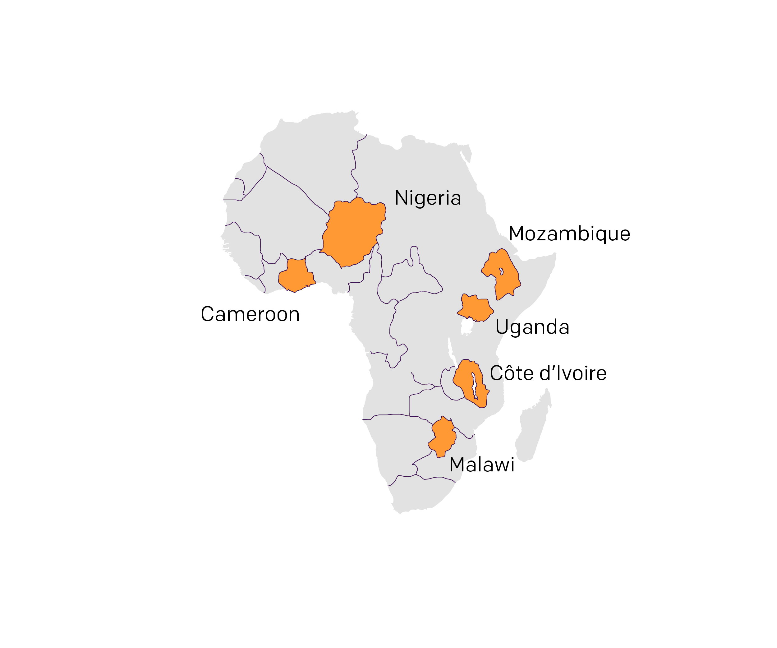
First, I have seen some media outlets claim “Cameroon” is an unidentified country. I think the designer clearly intended that one orange bit along the Guinea Coast of West Africa. The image quality did not permit me to really “see” what lines represented borders in northeastern Africa along the Red Sea and Mediterranean—think Egypt, Libya, Sudan, &c.
But now let us take that map and compare it to an actual map of African political boundaries—ignoring the…situations in Somaliland and Western Sahara.
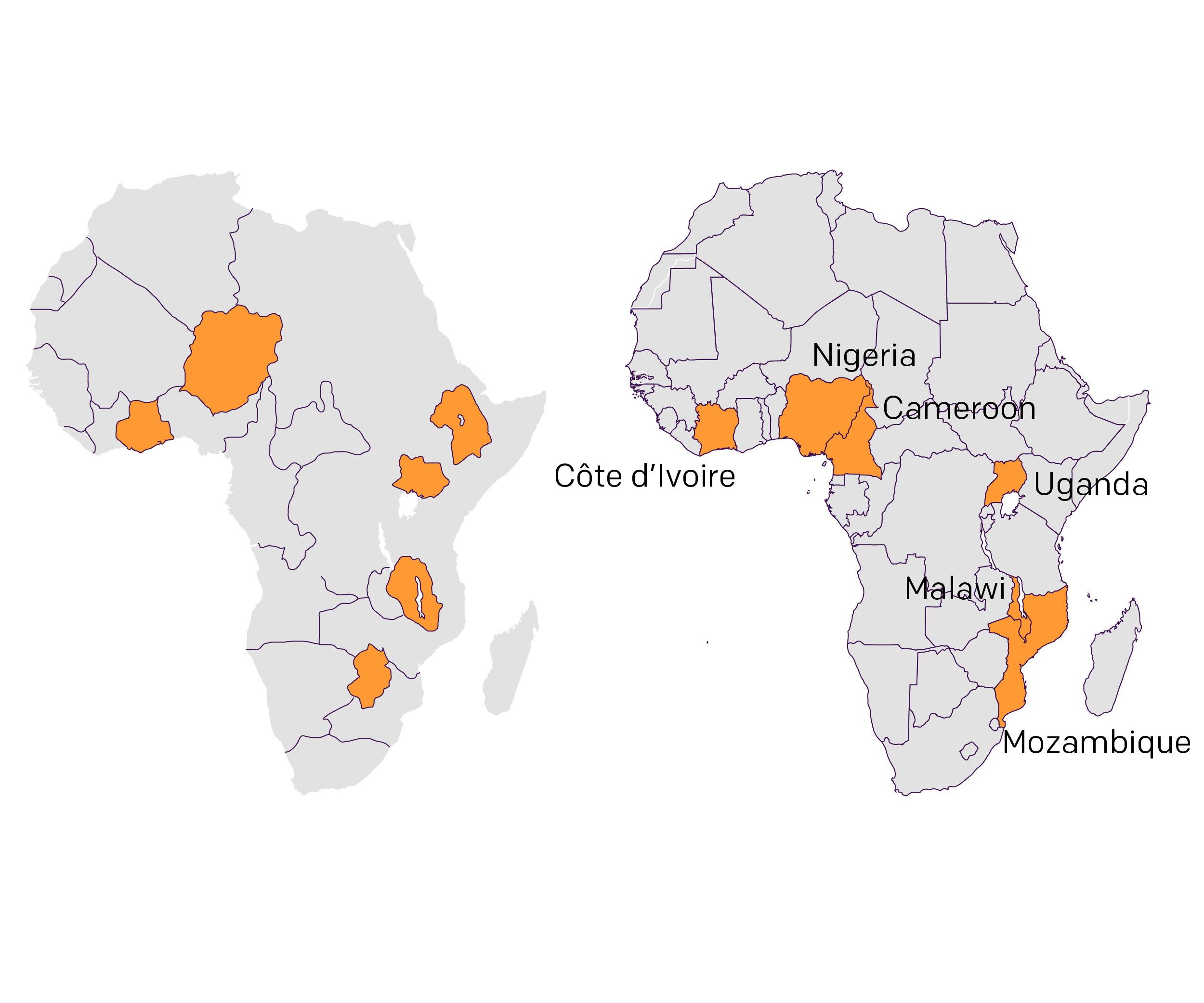
We also know, or at least it has been reported, the designer used AI to create the map and I think you take that together with the above and we can see what happened. (I apologise for the illegibility of my labelling, but we will sort that out in a bit.) You can see that AI sort-of-kind-of drew reasonable-ish borders. You can see the Central African Republic is a rectangular-ish blob in the, well, centre of Africa. You can see the diagonal line that forms the southwestern/northeastern borders of Algeria, Mauritania, and Mali. You can see Angola is kind of there. There is a southern African state at the southern tip of the continent—South Africa one presumes. Even along the Guinea coast you can see shapes that resemble what you would expect someone at a pub at trivia to draw on a scrap of paper as the shapes and locations of Liberia or Sierra Leone, Guinea, and Ghana.
But then AI or the designer labels Côte d’Ivoire or Ghana as Cameroon. Nigeria is roughly the same shape but is now landlocked and partially merged with Niger and Chad. Strangely, Uganda is kind of in the right place and you can sort of understand why, it famously sits along the shores of Lake Victoria, which as one of the most important lakes in Africa, AI clearly marked on the map. Similarly, Malawi is sort of in the right spot, but it now appears to be a country centred upon and surrounding Lake Malawi. No, that is actually Côte d‘Ivoire—you were so close, AI/designer. Instead, Malawi is actually located further south in what is reality southern Mozambique. So close to getting that one right.
The two I cannot figure out are Mozambique and Côte d’Ivoire. The latter, also known as Ivory Coast, maybe makes sense as the country surrounding Lake Malawi with a large interior coastline? But I just cannot understand Mozambique. That is until I look at how this map was presented.
Let us return to the original image once again.
I think the critical thing here is to look at the labelling on the right. These are a very neat series of nearly evenly spaced blocks of text. And the map provides suitably placed and spaced blobs that work for a nicely designed layout. That “Cameroon” just mucked it all up. Because, if you want to keep the labelling ordering correct—and that makes sense given the decreasing sizes of funding opportunities—you would end up where I tried to take this graphic for my social media post.
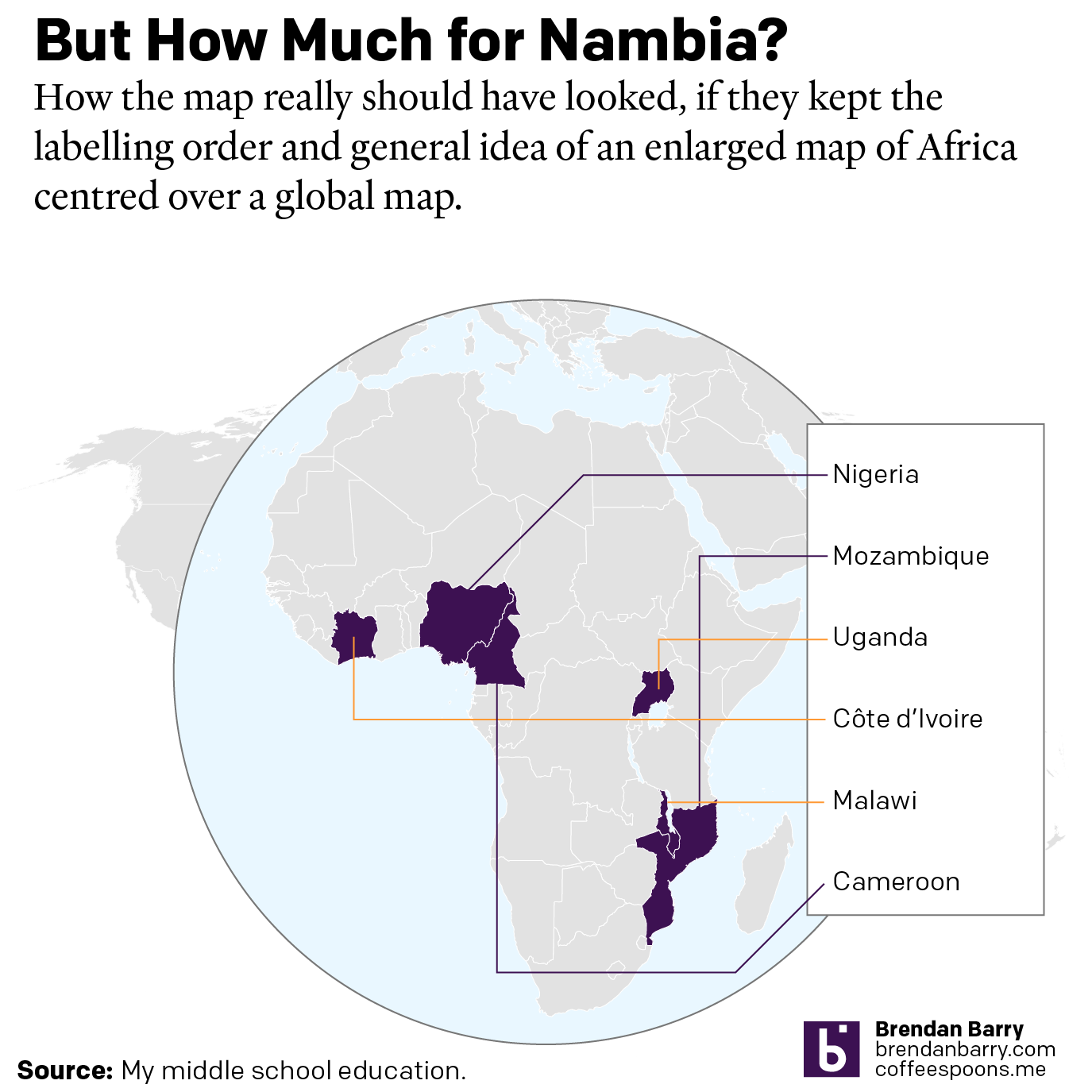
You can see how using lines to label the countries leads to overlap and criss-crossing lines. Not exactly ideal when you want a slide to look “pretty” and “well-designed”. The AI version looks like one a designer would create if he or she did not care about reality.
But do we really expect anything different from the current US administration? Something like 1/4 to 1/3 of the State Department has been cut. We have closed half a dozen embassies in Africa. We have deprioritised aid to Africa. We are feuding with South Africa over invented claims of ethnic cleansing of South African whites.
This map is funny, yes. But this is also the second run of the same administration whose head famously talked about the great country of Nambia in a meeting with African heads of state. I wrote about that back in September 2017. This map gives visual form to the disinterest the American government shows in Africa.
I had a whole long bit here about the foolhardiness of that approach as it relates to American foreign policy and geopolitical strategery. But editor me has excised that. The important takeaway here is more the cautionary tale of using AI to expedite and improve productivity. It can be a useful tool, but it is just that, a tool. And tools are often only most useful in the hands of those trained or skilled in their use. AI is the informational equivalent of handing middle schoolers power tools with limited or no supervision. What can possibly go wrong?
Oh, dear reader, you say what about Google? Oh…oh, dear…
More on that later, but for now, we can just look at this map made by the US government and wonder: Who is Spain? Why is Hitler? Where is Nambia?
Credit for the original is some poor staffer in the State Department.