
This weekend was a hot and steamy one in Philadelphia. And so this morning colour me not at all surprised when I read in the BBC that the oceans hit a record high in July. The article included a few graphics, one being a map of European soil moisture—spoiler, Europe’s dry. And I am certain that has nothing to do with all the wildfires in France.
But I really liked the following chart, a line chart with each year since 1979.
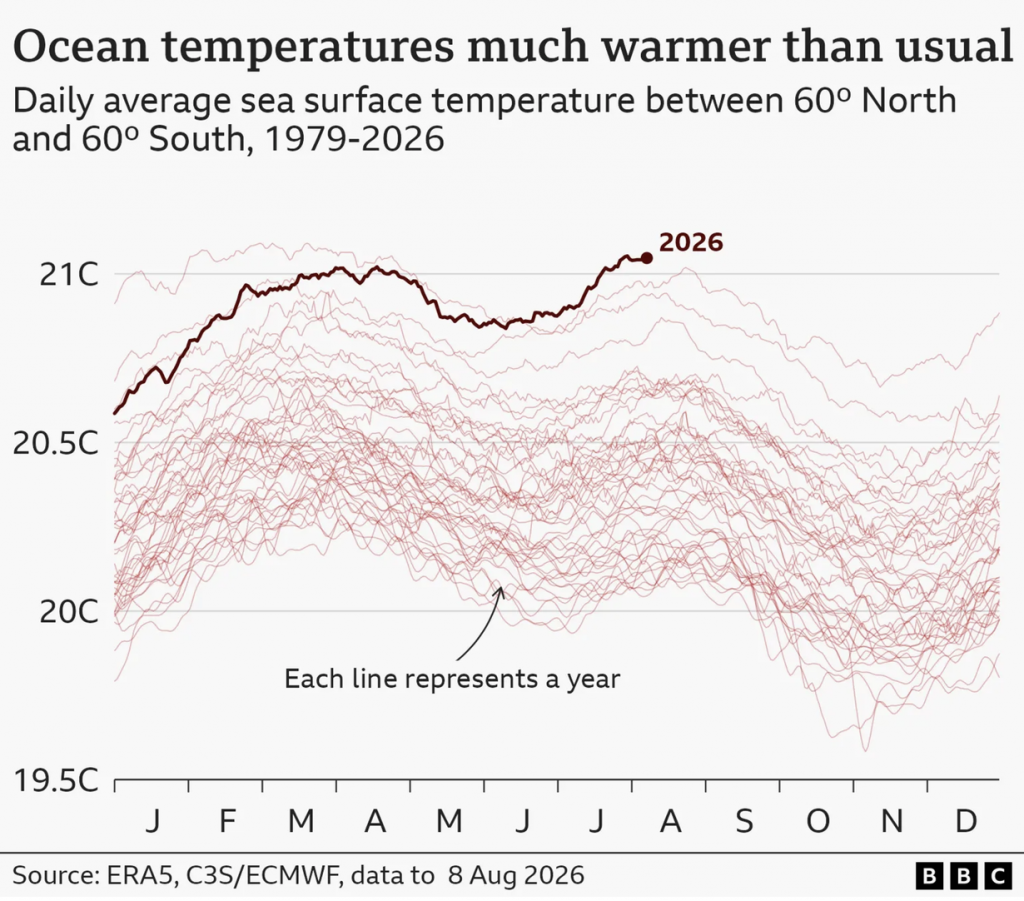
The important thing is not each individual line, but rather the 2026 line, which is why it sits in a darker red and a thicker stroke. I do wonder why the graphic requires the annotation explaining each line represents a year. I think the graphic’s title and header make that clear.
I have seen versions of this type of graphic where the lines’ colours correlate with the recency of the years, with, say, more recent years darker and more distant years lighter. Because I would bet that those lines near 2026 are also relatively recent.
Credit for the piece goes to the BBC graphics department.