Monday was an odd day, both 1 April and the start of baseball. I had a tough decision to make: Do I post a serious baseball-related piece or a humourous April Fool’s Day one instead? If you recall, I went for the serious baseball option. But that leaves me with Friday, where I try to post work that is a bit on the lighter side of life.
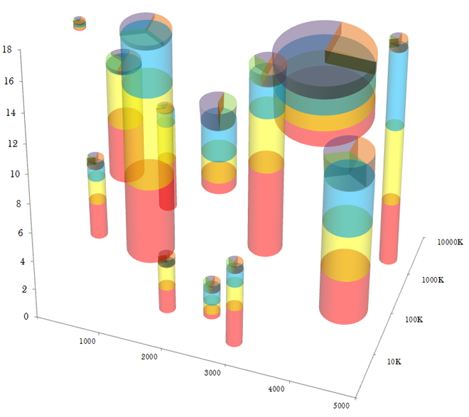
So here is EagerPies, published by EagerEyes on 1 April. It’s in the style of the EagerEyes site, a blog with posts about data visualisation. This selection is EagerPies work to improve upon Minard and the layering of data sets. But if you worry about complexity, fret not for they realised that encoding data in transparency would be a step too far.

Credit for the piece goes to EagerPies.
Leave a Reply
You must be logged in to post a comment.