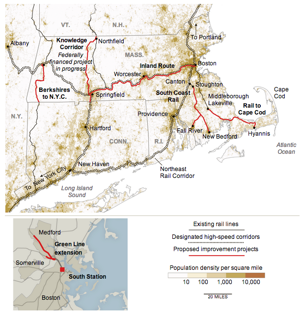
When we talk about new rail projects, or even highway or airport expansions, we like to include maps of new routes and destinations. In that sense this map from the New York Times is not new. However, we often forget in such visualisations that we have the opportunity to add layers of information that show why these expansions are beneficial.

Here, note in particular how the proposed improvement projects link the dense corridor of urban settlements stretching from Boston through Worcester to Springfield. Additional lines connect more distant southerly cities such as Fall River to Boston. These might normally be seen as dots at ends of a line, but by showing the density of the population in these corridors, readers can understand how the proposed lines might benefit more people than just those living at the dots.
Credit for the piece goes to the New York Times.
Leave a Reply
You must be logged in to post a comment.